
balance

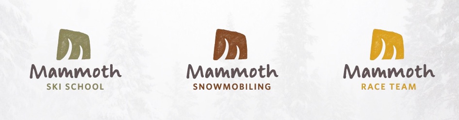
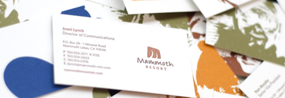
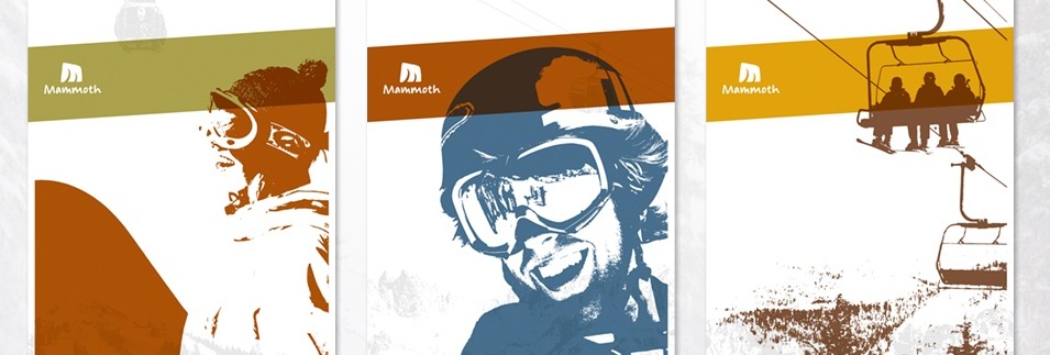
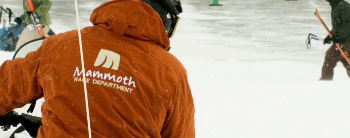
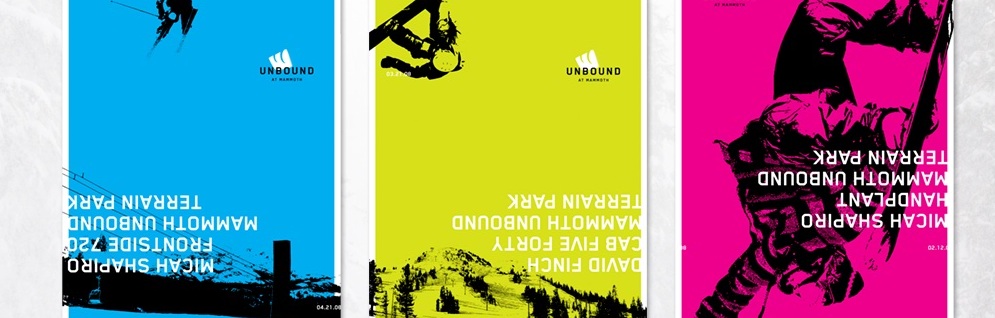
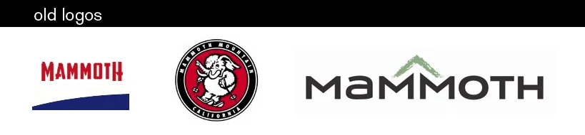
I don't know how long this has been out there, I just ran across it tonight on Identityworks, but California's Mammoth Mountain Ski Resort has unveiled a new identity created by Seattle agency Hornall Anderson. Mammoth has had multiple identities over the last several years, but I love this one. It strikes a difficult balance well - appropriately casual for their image but still maintaining a level of classic sophistication; hip enough to touch on the surf/snowboard culture but traditional enough to fit the ski culture. The mark itself forms the M out of what is a set of ski tracks to some or mammoth tusks to others. I especially love the business card design - again, balancing corporate professionalism on one side with youthful resort on the other. The identity is so cleanly done across so many application variations that it looks easy, but balance often looks easier than it really is. Check out a slideshow of the project here: