visionary?


If you wear contacts, by now you've hopefully heard about the not-exactly-a recall of "Renu with MoistureLoc" solution.
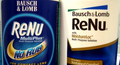
Ironically to me, I switched to this brand a few months ago because of the package design. A friend was visiting and I noticed his bottle of contact solution in my bathroom - I used Renu Multiplus, and I thought they were the same thing - but his had a better design. Next time I was in the store, I bought the MoistureLoc. All the text on the labels was pretty much identical, so I figured it was a newer name for the same thing. I was perplexed by the drastic difference in packaging.
I have no idea if it really is, but the MultiPlus package is typical of what can result from a committee of approvals and revisions - or just bad marketing direction: "well, we want the 'no rub' to pop" "okay, but can you make the comfort and lens wear line a little bolder?" "how about a shadow behind ReNu so it stands out more?" "can you jazz up the background, it's so plain" Ugh. It's a classic example of what I call "cheeze whiz". Terrible typography, way too many different typefaces, overdone meaningless decoration, no sense of priority of information - your eye goes all over the place, unsure which part of the label is most important. By contrast, the MoistureLoc label was clean, simple, clear. A much nicer Bausch & Lomb logo. Clean, clear priorities of information. One typeface. Use of negative space. Hints of this being part of a larger complete Corporate Identity. Not great design, but good solid work, and a huge imrpovement from the MultiPlus package.
It turns out these are two different products. The Centers for Disease Control is currently investigating 109 recent reports of fungal keratitis, a fungus that can cause blindness. 30 of the cases have been linked to ReNu with MoistureLoc. So far, that's all they know, so the company is recommending customers stop using the product.
I have to wonder what role, if any, a new package design may play in the re-introduction of the product if that should happen. Regardless, I guess good design isn't any good if you can't see it.