good news


I began my career in design for television in local television, meaning half of what I originally cut my chops on was news. Commonly, news is some of the worst design in television. There are lots of reasons for this - too many people calling the shots (design by committee); people in smaller markets aspiring to what bigger markets do, which usually isn't good in itself; news and management people making decisions that creatives should be making. News is traditionally some of the worst of big metallic 3D, continuous flowing blurred backgrounds, lightflares and shiny effects, and bad typography. Cable and Network newscasts have been no exception to this rule. Why? Because the people calling the shots there came from the smaller stations doing the same thing... big 3D makes them feel 'big time'.
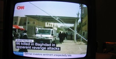
I was shocked recently when I read a piece about the recent redesign of CNN International. As CNN in the US continues to get worse and worse visually, its International counterpart has launched a bold and smart design system. I was underwhelmed by the stillframes I saw with the article, but while traveling through Europe, I discovered how well the design worked when in real time and in context. While the elements are almost crudely basic, all elements animate on and off in a way that adds a compelling level of energy but doesn't distract from the content.
Designed by London design firm Kemistry, the design avoids the reds and blues used in almost all news programs, opting instead for a clean and neutral black and white. Colors code other information, including topics in the lower crawl, which - doesn't crawl, making it much easier to read. (When will American networks ever learn that?) The new design gets rid of huge constant banners on screen, allowing the video and the news to be the star, not the graphics.
The system continues constantly through all promotional and on-air elements beyond the newscast. Other elements were designed by CNN in-house and by other design firms.
While I won't hold my breath for any American network or newscast (including CNN) to adopt such a design system anytime soon, you can see at least the in-newscast elements on the US broadcast of CNN from 9-10am Pacific time as "Your World Today". The American CNN content of the breaks takes away from the consistency, but at least some good work is still there.
congratulations to CNN International for taking such a bold leap.
For more examples, check out these links: