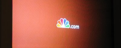
peacock = nbc


NBC has quietly started doing something small, but brilliant, that must have taken tons of meetings and convincing, and frankly am surprised ever made it past whatever approvals it took. (Thats not a slight at NBC, its a slight at the approval mentality that traditionally exists in large companies for creative decisions - I only assume it would be this way at any major broadcast network.)
You may or may not have noticed that they moved their corner logo "bug" from the lower right corner to the lower left. What many probably didn't notice (which is a good thing - it should be subtle and unconscious) is that they added a ".com" to the peacock for some periods. (I could be wrong, but I believe they used to keep the ".com" up, they are now dropping it after a few seconds) They also now end all their promos with a similar peacock ".com" You see "peacock.com" but your mind says "nbc.com". One of NBC's objectives (smartly, as shows are watched less and less on tv) is to drive traffic to their website. I can only imagine what a struggle it was to get the powers that be to allow a peacock without the letters NBC written out. The bug is also now a transparent solid instead of the messy clear logo with 'embossed' light and dark edges. Simpler. Cleaner. Better.
Years ago I worked at an NBC affiliate, and their corporate logo standards are stringent. Luckily, I got away with breaking them since we were only an affiliate. They were wanting to be bought by NBC, so a lot of the suits were wary of bending the rules, so I'd have to fight to do so. One of the rules of the logo that would drive me crazy is that it must always have a white border around the feathers. (pfftt!) Another is that the peacock can never appear without the letters "NBC" together with it. (pfffftttt!) Thats right, according to the standards, the peacock alone wasn't enough to say 'nbc', you had to literally spell it out. I ignored that one. Clearly, theyve realized that they can too. The NBC peacock is a beautiful clean simple but powerful mark. Its clear. The old bug with the chunky NBC underneath just cluttered up what was already recognizable. Similarly, the juxtaposition NBC uses of the peacock with the olympic rings is a beautiful counterpoint because the shapes seem to mirror each other. Yet in the official logo "patches" (as they call them) there is an awkward "NBC" thrown in between. I have no idea, but I can only guess thats because someone in a boardroom made them.
I ran into a friend who works at NBC recently and she asked what I thought about their current package. I mentioned the peacock.com and her eyes got wide. I told her I could imagine that took some effort to get approved. She neither denied nor confirmed, but she did let on that it was a big deal, and said "we [focus/research] tested, and the peacock tested far higher than the letters 'nbc'." Go figure. Congrats to NBC for discovering the strength of their logo as a mark alone - and using it without extra clutter to diminish its power.