classic

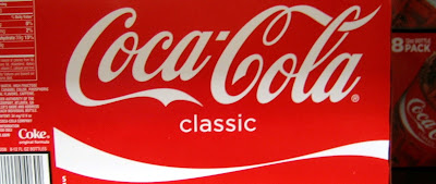
A couple weeks ago I wrote about the recent redesign of the Diet Coke and Diet Pepsi labels. What wasn't on the shelves at the time was the new label design for Coke Classic. I read a piece about it recently and saw it tonight at the store. I'm a Pepsi guy, but this is a thing of beauty. Ever since its introduction, Coca-Cola Classic has had an ever-increasing need to cover its labels with extraneous seals, bubbles, stripes, bevels, edges, shadows, doodads, gizmos, what-have-you. Its a (pardon the pun) classic example of destroying a beautiful and timeless logo, but typical of what happens in packaging and advertising with the need of marketing departments to pack everything they can into whatever they can. ("Add this! Jazz it up! Make it pop!") How this new label made it past all the approvals is beyond me, but it boldly projects confidence and respect for the Coca-Cola logo and brand as a piece of American culture that should not be adulterated. Kudos to Coke for having the balls to go with such a clean design.