star quality


You've undoubtedly heard some of the hoopla about David Beckham and his wife Posh Spice moving to LA. I'll admit, when the LA Galaxy soccer/football club first signed him, I was shocked. But I'm intrigued, it somehow gives an immediate legitimacy to American soccer. I didn't grow up around soccer, so it was never on my radar. The passion for it I saw in Brazil and Europe intrigued me though, and this is probably the straw that'll get me to go to a game here.
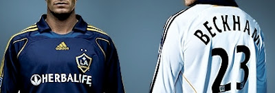
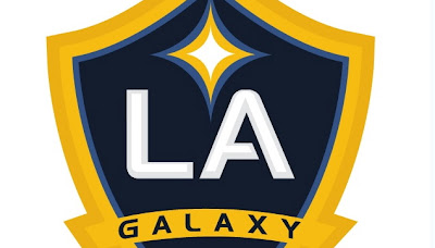
The team has unveiled a new look and logo to coincide with Beckham joining the team. Brand New (where the top image was stolen from) had a mediocre review of it today, but I have to say I think its excellent. The old logo always seemed like a second thought to me - more like a drive-in theatre or a diner than a sports franchise. The use of the crest shape gives the new logo a tie to European soccer (football!) identities which gives the Galaxy an instant level of credibility: no longer seeming like some second-rate American sport. The starburst is clean, simple, and dynamic, as is the deep blue and gold replacing the old green and gold. They have resisted the overdone twenty-elements-in-one-logo phenomenon typical in sports logos. And best of all, there are no unnecessary gradations, bevels, swooshes, and edges that I constantly rant about. The type is a little cutesy with the unnecessary break in the A and rounded L, but overall, the new identity is bold, regal, and sharp. This is a rare level of simplicity and cleanliness for a recent sports logo. Goooooooal!