mtv comes clean


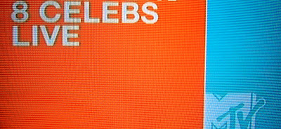
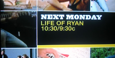
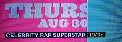

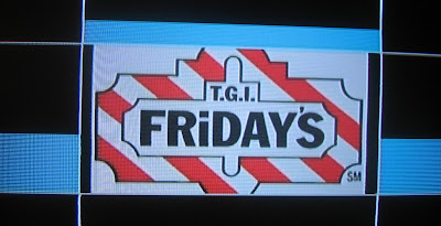

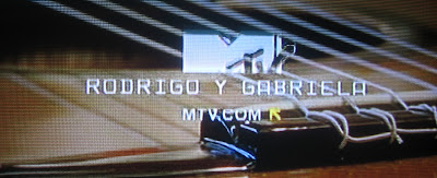
A few weeks ago mtv launched a new on-air design that is more comprehensive than anything I've seen on mtv in years. The look is simple and clean, with colors and typefaces that give a knowing wink to the audience. It talks up to them, which is a huge accomplishment for any network that caters to the exceptionally media and marketing savvy youth market. For years, mtv's brand has been in its voice, but its visual style never had any consistent look. I often wondered if this was intentional, as an acknowledgment that their audience didn't respond to a consistent look - mtv is well known for intense audience research, after all. Regardless, I love their new look. The typography is smart, the variations on the theme and palette offer endless combinations within a consistent look, and the use of the cropped logo is a great wink at the audience, letting them know that mtv gives them some credit for their intelligence. If I find any info on the designer or firm responsible, I'll pass it on. I am curious to see how long they stick to the look after years of having many different looks on air at once, but for now, they're looking better than ever.