disgraced odyssey


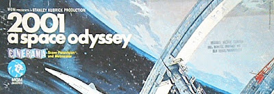
2001: A Space Odyssey is one of my favorite movies of all time. On top of the movies quiet boldness that may still be ahead of its time, I always loved how classically understated the poster/advertising for it was, especially the type always set in Futura Extra Bold. Classic and quiet, yet bold - much like the movie. None of the cheesy, expected science fiction cliches - it always stayed above that, and I admired that. So when I saw a link on Design Observer that the new DVD reissue had done a redesign, I steeled myself. And naturally, I found myself in a 'what were they thinking' moment. Seriously, what were they thinking? Did some kid on an assembly line churn this out without knowing anything about the movie? To its credit, at least they didn't add a swoosh and 3D extrusions and gradients - and if I had never seen the original, I wouldn't think this was awful. But I have, and that design is part of the movies (40 year!) history. A little digging made me realize that not only is it just an unnecessary change of a time-tested classic, but also in some respects an affront to the Director, Stanley Kubrick. According to Experimental Jetset: a quote pulled from an article in The Guardian revealed that Kubrick had an obsession with the typeface Futura: "It was Stanley's favourite typeface. It's sans serif. He liked Helvetica and Univers too. Clean and elegant". Sigh. The only silver lining to it all is that the Experimental Jetset site featured a project where they designed their own 2001 poster using only type - with beautiful results, brilliantly basing their poster on the black monolith that is the signature connecting element in the movie. Though this doesn't use the Futura either, it respects and references Kubrick's appreciation for classic sans serif fonts. This solution is even better than the original, yet I fully realize its the kind of solution that would never make it to commercial approval. Nonetheless, it is a great specimen of communication using nothing but typography.