recognized


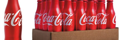
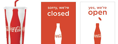
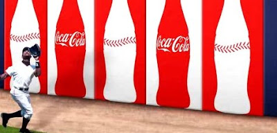
Almost a year ago, I wrote about the new design of Coca-Cola's packaging that took a bold but beautiful turn toward classic simplicity. Gone were all the extraneous bubbles, bursts, squiggles, gradations, dimensions, etc. I found myself shocked and overjoyed. Oddly enough, that post has become the most clicked-on post of the blog. The only thing better than seeing great design used well on such a universal scale is seeing it recognized. The firm responsible for the Coke redesign, Turner Duckworth of San Francisco, just won the first ever Design Grand Prix at the Cannes Lions for the Coke redesign. "We know when we see something that's great," said the head of the jury for the awards. I still am amazed that this ever made it through the approval process. It's just too good. Only tonight did I discover a comment on my original blog post from David Turner: "As you guessed, it was no small task getting Coke to use such a simple design, but we had some strong advocates within Coke who helped push it through." The more I see it applied to more varied uses, the better it gets. Turner Duckworth also won a gold for the new red aluminum bottle, which as they say "feels at once familiar and new." The links below take you to a .pdf case study of the redesign and a short video about it. Congrats to TD and Coke on the awards. Enjoy.