
when good logos go bad
There are classics in design, just like there are classics in literature, architecture, and art. When a private owner owns a piece of great architecture, they can often destroy it at will. The same holds true for design.
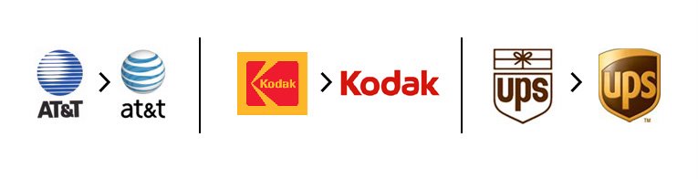
A few weeks ago I was sitting in my truck and looked next to me, only to see a huge bastardization of Saul Bass's classic AT&T logo on the side of a van. This was not the classic logo I remembered seeing when I was in middle school. I don't know why I noticed it back then - I didn't know jack about design. I remember being sad at that time that the classic Bell logo (also designed by Saul Bass) was gone, and didn't understand why. But something about this new logo captured me. And I remember the animation of lines traveling back in perspective from the bottom of the screen that turned into this new AT&T globe (graphic animations were still fairly new in advertising at the time). In '91, it was decided that the public was not smart enough to figure out the globe representation, so they filled in the background with solid white and added a shadow. Now, in an attempt to be "friendly" and "transparent", they've mangled the mark to something that no longer makes sense, and tacked on awkward type that fights the logo.
My friend (and fellow designer) Bill Dawson writes about this much better than I can here:
Recently, Kodak dropped its trademark yellow and K. A couple years ago, Paul Rand's legendary UPS logo was turned into a video game shield. Chermayeff & Geismar's boldly simple Mobil Oil identity system is gone. Slogans and ad campaigns are temporary and meant to change over time. Logos, however, should be timeless. These new logos aren't.
(and on a personal note, I hear the Fine Living network logo I breathed and loved daily for the last four years [designed by Johnson+Wolverton] is being altered and "softened". ugh. stay tuned.)