
the worst type
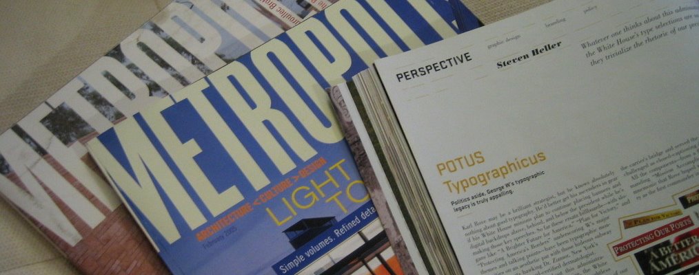
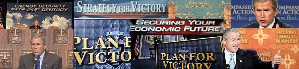

One of my favorite magazines is Metropolis. I love their way of seeing beyond just graphic design and instead into the role it plays in culture, architecture. spaces, and products. The new issue has a Perspective column by Steven Heller on something that has been making me crazy for the past several years - the message backdrops that appear behind George Bush at speeches. No President before Bush has had to rely on a typographic message to get his message across. (My favorite is still the one for 'Strengthening America's Economy" where they surrounded him with boxes on which they had to tape over the 'Made in China' printed on the boxes and add fake 'Made in USA' labels.) The link at the bottom will take you to the actual article, but it is for print subscribers only on their website (which seems like a shame - wouldn't you gain more subscribers through web traffic?). Here are some of Heller's comments:
"Whatever one thinks about this administration's domestic and foreign policies, the White House's garish type selections are so thoughtless they trivialize rather than enhance the rhetoric of our POTUS (no, not a synonym for doofus--or that substance he used to smoke--but rather the Secret Service's acronym for President of the United States). While his handlers would never allow the leader of the free world to go out in public wearing a rayon leisure suit and white bucks, they nonetheless use clownish shareware typefaces with hokey beveled edges and cheesy drop shadows to represent his ideas."
"...[the 'Mission Accomplished' banner] debacle has not prevented the White House from penning more slogans and designing additional signs set in garish types with cliched graphic gimmickry derived from overused Photoshop filters. And what a bag of tricks they are. The most persistent is the use of Roman-like faux intaglio and engraved letterforms to give an air of authority and truth--although the effect is more Las Vegas casino. To celebrate the fourth anniversary of the "No Child Left Behind" act, someone got a little creative and added a drop shadow to a font that fakes the look of chalk or crayon lettering. This is only one evolutionary step away from introducing the Lariat font (novelty letterforms made from rope) whenever W is speaking from Crawford, Texas. Another intelligent design trope is the use of secondary colors to "complement" the classic red, white, and blue backdrops at many of his speeches. Sparkling gold and silver are now favored, as if a little bling might instill ideas pimped by POTUS with a certain regal street cred. He bad!"
"...Beveled edges and Photoshop drop shadows may be fine for candy bar and football logos, but they don't give our country the credibility it wants or, for that matter, deserves. In the final analysis, good typography is patriotic."