
well hung


Okay, well first I must apologize for the irregularity of my posts the last few days. I try to post every day, but sometimes it just doesn't happen. As my blog has developed, it has become somewhat image based. I made a grave error this weekend when I went to San Diego and forgot to pack the cord that allows me to download photos from my camera. I did get the posts from Saturday and Sunday by borrowing my friend Tim's cord. But I'll post some catch up posts over the next few days.
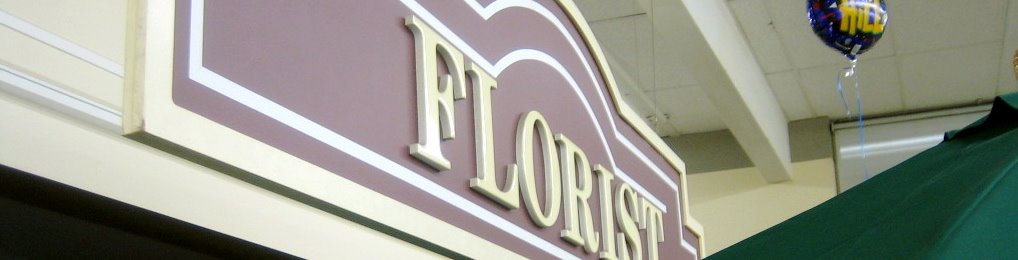
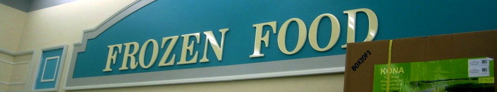
Last night I found myself in an old Von's - a grocery store that clearly hasn't been remodeled in quite a while. I wouldn't be surprised if it has been 6 months from now or whenever I'm in San Diego next. But I realized how much the bad typography of the section signage really felt like what I grew up with in supermarkets - and how that just doesn't exist as commonly any more. I'm surprised someone hasn't created a typeface called "Supermarket". (Maybe someone has, but google didn't turn one up.) I have kind of a love/hate relationship with bad typography like this. Maybe its unfair to call it bad - just dated. It isn't like it has needless bevels and drop shadows, the kerning isn't as bad as it could be for plastic letters that I'm sure were hung on a wall by hand... It has its place... both in our memories, and on a wall somewhere.