
chevrong
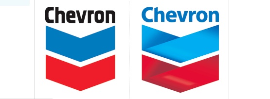
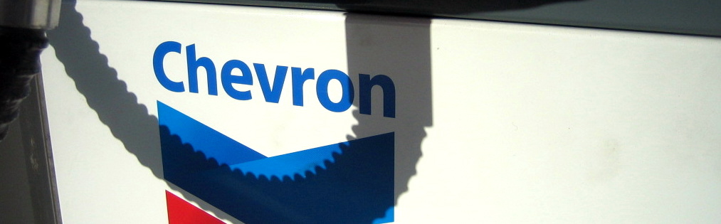
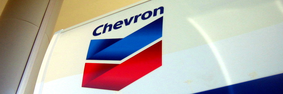
The Chevron station near me has been undergoing a facelift. In May of 2005, Chevron changed their corporate name from ChevronTexaco to just Chevron Corporation. To go along with it, they changed their logo. Some articles say that it seems this was a bit of the former Chevron head sending a message to the former Texaco head that "I'm in charge". Reeerrrr. The existing Chevron logo had been in place since 1969. It seems there was no reason for the redo other than to "jazz it up". Even Chevron's own marketing and press material about the logo change only says "Moreover, our new corporate symbol will provide a more contemporary image for the forward-looking company we are today." In other words, the change doesn't mean anything or have any reason. Its yet another example of trying to fix something that wasn't broken. The chevrons are no longer chevrons, but now are 3D ribbons. The type is more current and softer (with some questionable sizing going on in the C), but like the new att logo, doesn't work so well with the logomark. When reproduced small in one color, its a mess. The old logo may not be historical genius like the old ups logo, but like ups they've sacrificed a classic bold logo for something trendy and reliant on full color applications to reproduce well. It isn't terrible, but just because you can, doesn't mean you should.