bio logical


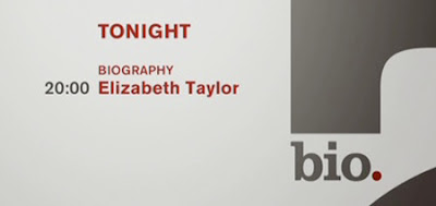
Several months ago, the Biography Channel rebranded itself as "Bio." In doing so, they are reflecting a move in their programming from schmaltzy celebrity biographies to stories with more of a crime and punishment / amazing-but-true stories bent. (In the interest of full disclosure, I knew about this one ahead of time because I did a quick small motion test for a firm that was pitching this job. That firm didn't get it, but I was intrigued to see who did, and what they did - because the already-designed new "Bio." logo was wonderful.) The logo is cleanly and simply set in Clarendon with a period after the word. The period naturally is a central focus, but in the network graphics package that was designed by Leroy + Clarkson, the forms that the letters of the word create become the basis of the look. Smart compositions and bold colors with simple but dynamic motion create a surprisingly flexible set of pieces that can be used in all kinds of ways across the network. More importantly, the look is distinctive and bold as a rebrand, but also versatile; plus it has great possibilities for growth as the brand ages. Its great to see smart design used so effectively. You can see a montage of the look here:
