
bottled up
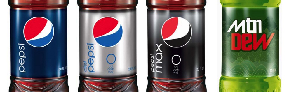
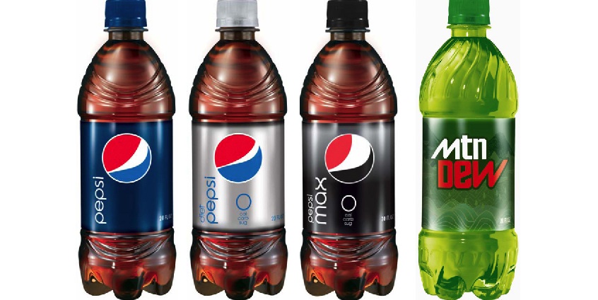
More on the Pepsi redesign... In these images stolen from Under Considerations blog 'Brand New', we see more of what might be the new design for Pepsi's packaging. Its worth repeating that we don't know if these are real; and if they are real, whether they are just proposals or actuals. Judging by the comments on Brand New, everyone hates them. While I don't love them, I think they are a vast improvement from the current packaging. I'm still not sold on the changing logo/smile concept. I think its a great idea for an ad campaign, but not a logo. Otherwise, I appreciate the cleanliness and consistency. The wave in the 'e' of Pepsi is cute, but a little too subtle. And if the original globe is gone, what is it even supposed to relate to? And yeah, we won't even talk about the shape of the bottles. Still, I think its better than what they have currently, so at least its an improvement. I'm just curious if some branding execs are flipping out about the leaks, or if theyre jumping for joy about how well we've fallen for some kind of intentional guerilla/viral focus group test.