
changing world
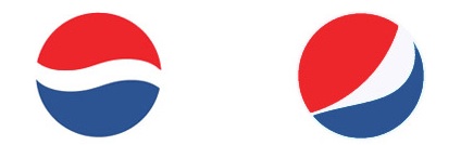
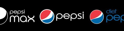
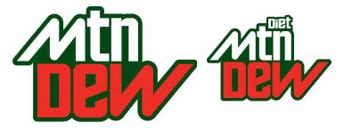
A lot of people in the design world are flipping out about Pepsi's new rebrand. While it has been announced, it hasn't been released yet. The most information and best images that I've been able to find are from Under Consideration's blog called Brand New. What we know... or think we know... is that Pepsi is changing its blue and red globe to be a smile - and each variation of Pepsi will have a different kind of smile - from a grin to a laugh. How cute. One of the readers of Brand New dug around in the Trademark systems files and found these images - which may not be final, but are a first glimpse of what could be. Not only is Pepsi rebranding the Pepsi drinks, but also Mountain Dew, Tropicana, Gatorade, etc. My feelings are mixed on this one, and I'm trying to wait to judge. Pepsi's brand, logo, and packaging have been truly awful for the last ten years or more. Their latest iterations are examples of what could be the worst in package design. I'm a Pepsi drinker and I have even walked out of a store with the wrong flavor drink because the labels have become so confusing and overdone. But the cleanliness of these examples may not be reflect the final designs that finally appear whenever they do. And I'm a little mixed on changing the logo for each variation of Pepsi. While its a clever and friendly idea, does it dilute the strength of the logo? They are clever because they are variations of the globe, but once the globe is gone, they've lost the basis of their existence. The globe is such a strong symbol with such brand equity, is it one you really want to allow to disappear? However, the strongest venom I have read is in response to Mountain Dew being changed to Mtn Dew, as well as its new design. I can't say I'm bothered by this one. Mountain Dew has a specific target demographic that is imaged around action sports like snowboarding and skateboarding. The new logo fits right in with that world - and the Mtn also fits in with its text-messaging fluent young audience. Plus, Mountain Dew's existing logo does not really have anything to merit it as being one worth saving. The only cautionary part of it is that changing the name is like changing a logo - not something to be done lightly, because it (if done well) should last for years. The branding that goes with the logo can change as times and campaigns demand, but a logo should be a constant. Will 'mtn' seem trite in only a few years? It's going to be an interesting one to watch and see what happens. And like Walmart's new logo, its also an interesting study on what happens when logos go public before they are meant to.