trust
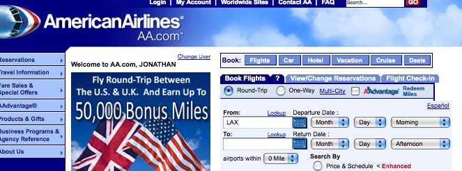
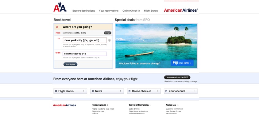
You may have seen this one making its way around the interwebs last week. Its a pretty interesting study of something thats pretty common anymore - as referenced by how often I find myself saying "I can't believe this one got approved" when some really great design is done by high profile product or company (like, for example, the current rebrand of CocaCola that was done a couple years ago). A web designer named Dustin Curtis was so exasperated with the American Airlines website that he quickly mocked up a version of how good it could be and posted it with an open letter on his website. Much to his surprise, he heard back from the company. A user experience (ux) architect (a guy who helps build websites) at the company wrote him, essentially saying that there are so many people and so many groups involved that its impossible for a good product to ever make it through the system there. (He did say they were trying to make small improvements wherever they could.) Curtis makes an important point - a brand is more than a logo and design, its an entire user experience - from on the web to on the plane. If you're not providing a good experience, you're not giving someone a reason to come back when they have a choice. We saw it kill Circuit City. It even comes back to that glass of water at Simmzy's pub I wrote about yesterday. But good design plays an important role in creating a good experience for a customer, and good design cannot be done by a group that is afraid to reach beyond the lowest common denominator. Apple and Coke have figured that out (and I would wager that 200 people aren't involved in making their design decisions). Trust the vision of the people you hire with the decisions you hired them for in the first place.


