typecasting

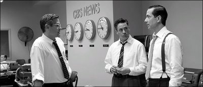
My friend Tres pointed out a great article in the New York Times today. It's called "Good Film, Shame About the Helvetica". In it, Peter Edidin writes about period-piece movies that go to great lengths to be historically accurate, but then use typography that didn't even exist. A good example is in this image from "Good Night and Good Luck" set in the early 50's with a prominent use of this "CBS News" sign - yet the sign is in Helvetica, a typeface that didn't exist until 1957. Apparently the article hit a nerve with the art director of the film, who emailed in to say that the sign is actually Akzidenz Grotesk, a face that predated and was the basis for Helvetica. So it turns out that she did her job well. Nonetheless, its a fascinating topic with no shortage of inaccurate type choices...
You'll need a free website subscription to read the article, but you can read it here:
Here is the more detailed website of a designer featured in the article who blogs examples:
