
its official
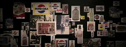


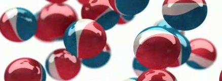
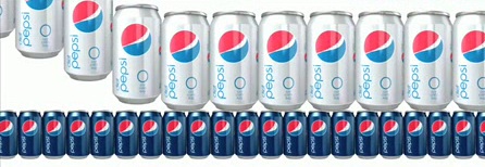
Still following up on the Pepsi stuff that I posted about last week and has been the buzz around all the design circles (not that I know what a design circle is, other than thats just a way to say that I assume its not something normal people are writing or talking about)... Pepsi mailed out promo packs to a bunch of folks (I wasn't one of them) to show off their official new packaging, along with a pretty well done promo video. Based on the dimensions of the video, it looks like it was created for an installation like a building lobby or advertising wall, though without the audio it would certainly lose some of its punch. I think I'm still at the same place I was when I saw the first glimpses. I like the clean and simple packagaing overall, especially compared to their couldn't-be-much-worse current packaging. I don't care for the new changing logo. I think its a clever idea for an ad campaign, but think the actual logo should be a constant and carry on the historic globe they have had for so long. Its a shame to see that go. I've heard a lot of criticism over the typography. While I think it could be better, I don't think its terrible, and again its a vast improvement over the current. This is no home run like the Coca-Cola revamp I've written about a couple times here. Admittedly, I'm quick to praise a clean and simple solution over more overwraught design for most anything, but I'd still say its probably a triple. Once it hits the shelves, it'll be easier to make a real judgment. In the meantime, here's the video: