observed
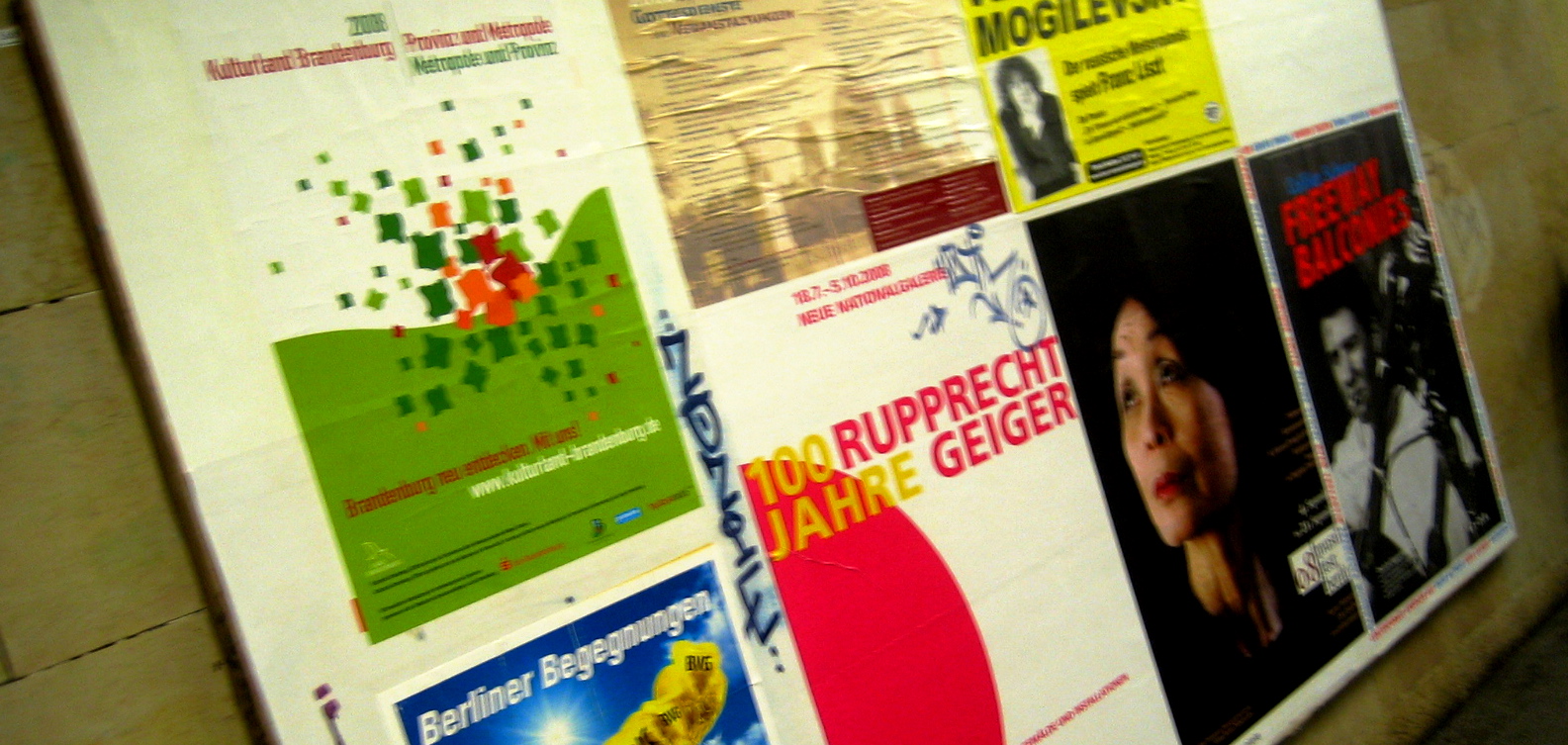
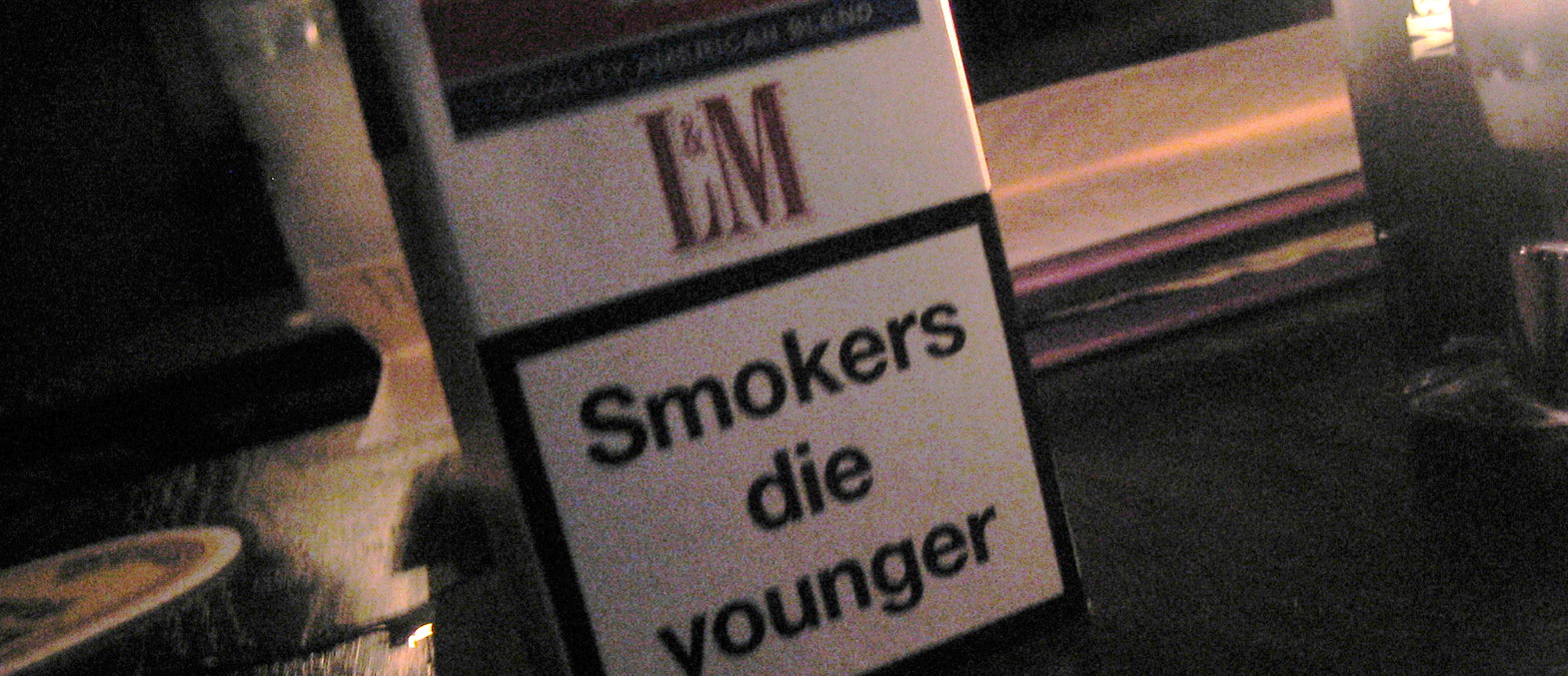
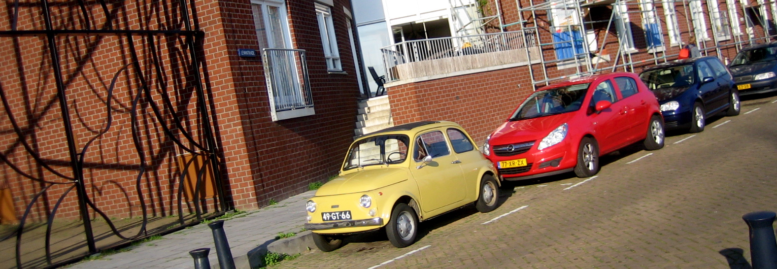
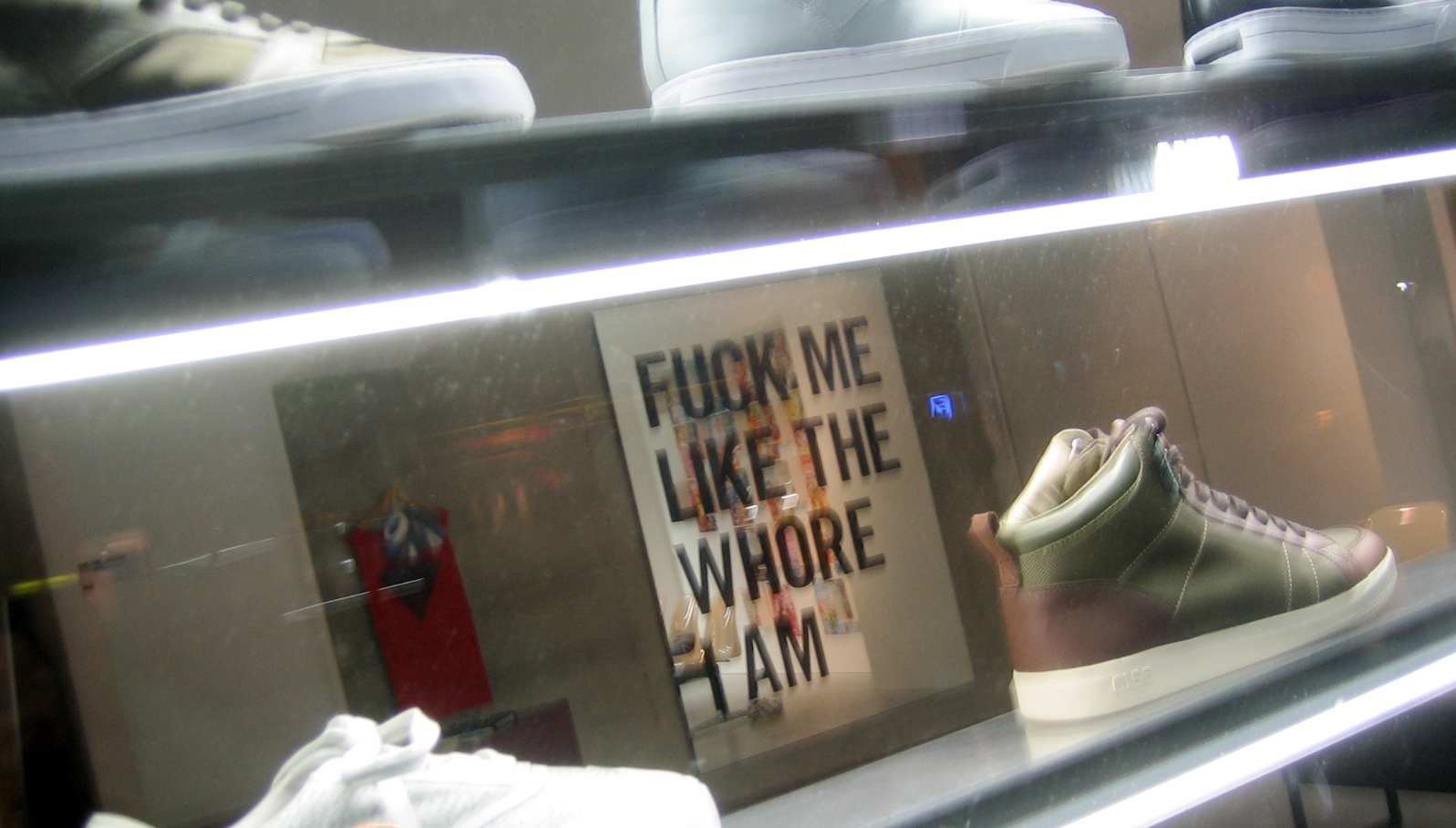
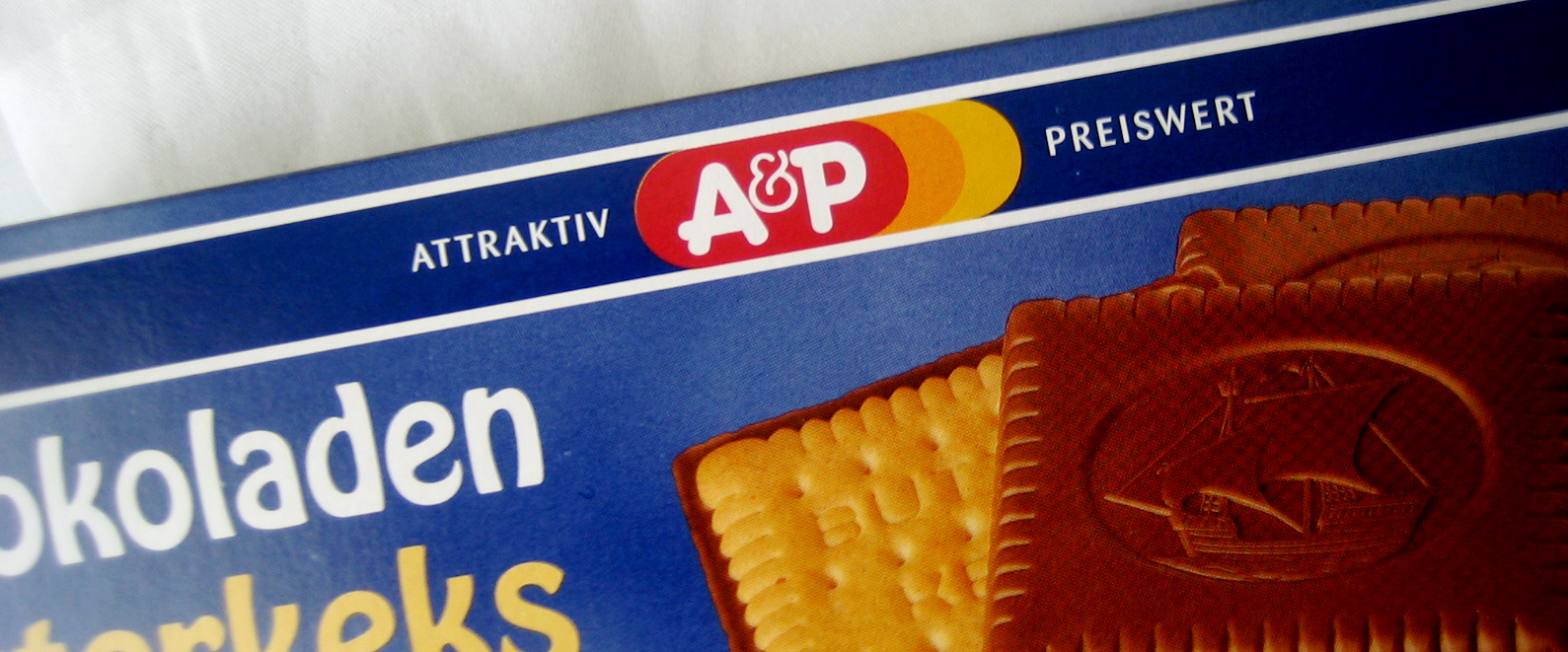
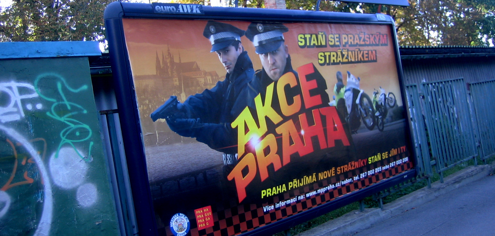
A few random observations from my tour of Europe... Even posters in the subway in Berlin show a nice clean sense of type and composition... Health warnings on cigarettes are a little more blunt. Though it doesn't seem to discourage anyone... Little cars are really little... Posters in sneaker stores are as bold as cigarette health warnings, or - um - maybe moreso... A&P lives on! (It was a supermarket in my hometown when i was a kid - I don't know if they still exist in the US or not, but they used the exact same logo)... Police Department recruiting billboards are bold, too. I don't think you'd ever see one in the US that showed officers with guns drawn and motorcycle cops doing wheelies.

