
new jack city

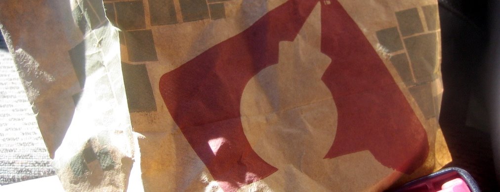
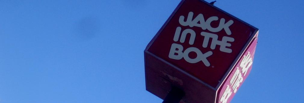
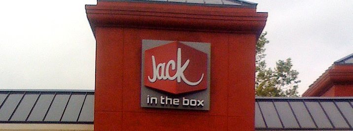
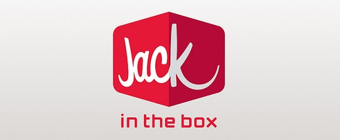
Today I saw a sign at a local Jack in the Box, but what caught my eye was not the message itself, but the small logo centered at the bottom. It wasn't the normal familiar Jack in the Box square, but instead a script-ish "Jack" on a representation of a dimensional box and a small "in the box" underneath. It didn't appear on the other menus or signage nearby, but it was clearly designed and not likely a creation of just this location or franchise owner who might have made these specific signs. A little Googling showed that this has been making the rounds for months, and I wasn't the first to catch something new. Apparently, Jack in the Box is indeed changing not only its logo, but its image. In an effort to make their outlets more upscale fast food, they are remodeling their restaurants to match those that have already been done in San Diego and adopting the new logo with them (seen in the last two pics from images found on the flickrstreams of thr5 and Allison Newhouse/Duffy & Partners, who may be the designers?). I also didn't realize that the Jack silhouette within a canted box that was on the bag was a new secondary logo. I thought it had been around a while. As for the overall product change, I'm surprised. It reminds me of Burger King's attempt a couple decades ago to go upscale with table service and silver utensils... it didn't work. And Jack in the Box has one of the best managed brands around. It has managed to stay fresh and current with great advertising campaigns and consistent visual ties. But if you're changing the overall product, then a logo change is valid. And given that, the logo isn't bad. It retains a bit of retro-cool winkishness (I know, not really a word) inherent in the current brand and maintains elements of the current feel, while simultaneously relaxing and modernizing it. I'm anxious to see how it plays out over the next few months.