
benchmark

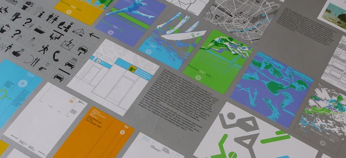

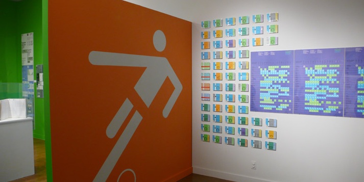
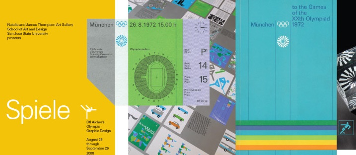
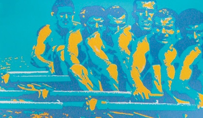
The 1984 Los Angeles Olympics were a formative event for me from a design perspective. I had never seen design applied to so uniformly and consistently to anything before and it made a lasting impression. But the Olympics that are said by many to have been the best designed but sometimes overlooked were the 1972 Munich Olympics. Otl Aicher led the design of those games, creating a more extensive and comprehensive visual identity than had ever been done for an Olympics. The pictograms Aicher created for the games were done with such elegance and clarity that they would never be topped, and were later adopted and expanded to become today's universal standard system. The Munich 72 design system drew on a palette developed from the Bavarian heraldic colors of light blue and white, with a range of supporting colors like greens and golds. Anxious to obliterate the image of Hitler's 1936 Olympics in Berlin, "Aicher devised an invigorating, almost Day-glo palette for the Olympics that was utterly free of red and black - banned for their association with the German flag. Athletes depicted in the official posters for each sport had their uniforms stripped of any national identifier, leaving the emphasis firmly on individual effort. Even the logo for the Games, a graphic of a radiant sun, hammered home the message of universality and, above all, optimism," said the Daily Telegraph of the work. What I find amazing about it is how nearly 40 years later, it still looks fresh and current and less dated than even the look for the 2008 Games. London design firm Bibliotheque curated an exhibition of Otl Aicher's design for the Munich games last year in London. That exhibition is now at San Francisco's Museum of Modern Art until July 7th. It may be worth the trip.