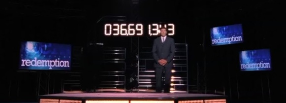
monitored situation
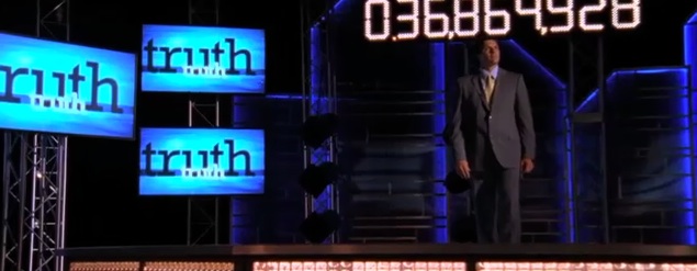
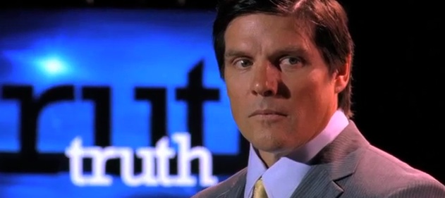
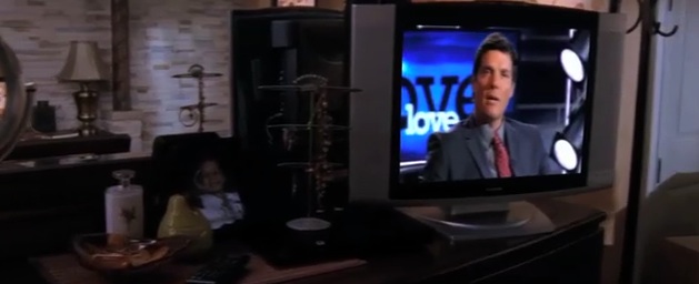
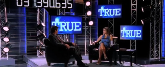
A couple months ago I posted some stills of this project, but I finally have edited and posted a video of some work I did for the CW series "One Tree Hill" last season. In the show, a character who is supposedly living on borrowed time is the host of a talk show. The art director contacted me about creating an animation of the show logo as well as cycling keyword animations to match the content. The design was made to be intentionally conventional and typical of a medium to low budget talk show, and because script changes or production setups could change at the last minute, we designed a couple formats that could be turned around quickly. While I had seen sketches of what the set would look like, I never saw the monitors in use during production, so I was happy that one feature ended up working exactly as I had hoped: One of the formats features the larger dark word, with a bright duplicate word in the foreground. When shot from a distance, the dark background word becomes prominent and easily read while the foreground word almost disappears; but when the same graphic is shot closer, the bright foreground word is easily read while the larger dark word falls into the background. You can see what I mean in the shots of the monitors that say "truth." Just one of those details that I was glad to see work out. Check out the video montage of them on the updated recent work page of my website here:

