springboard
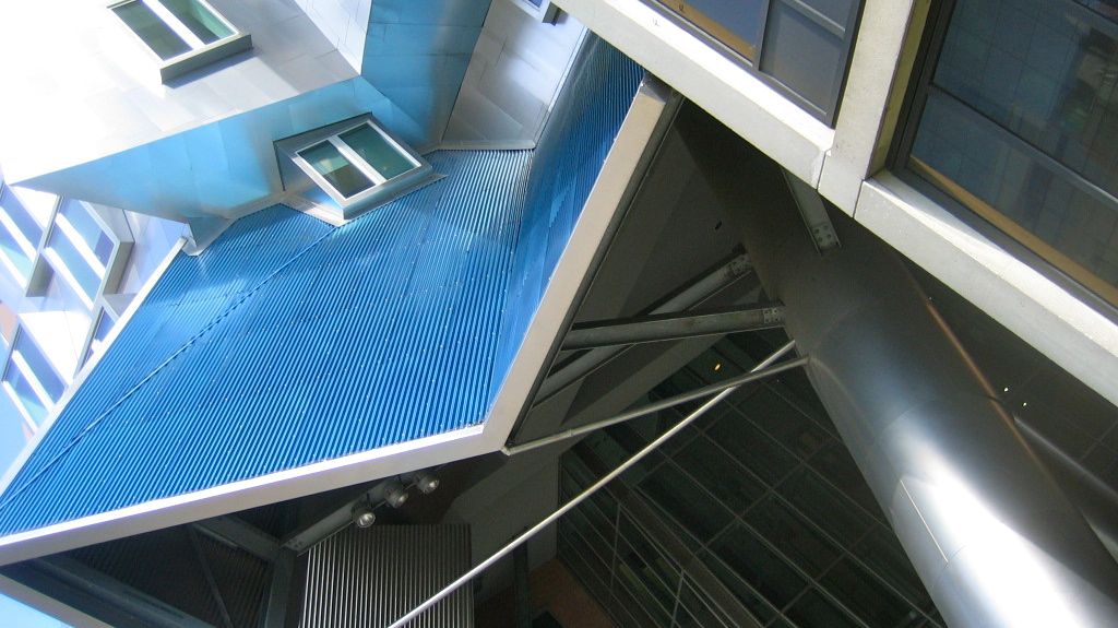
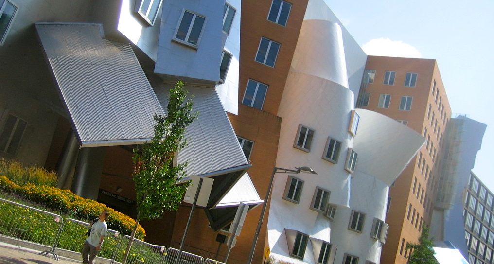
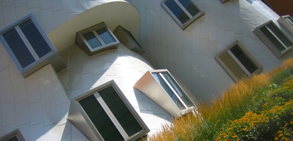
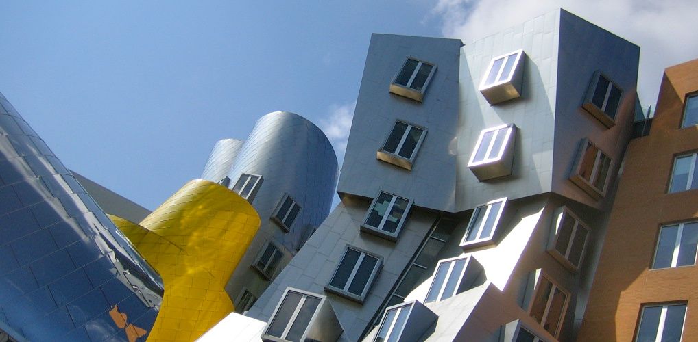
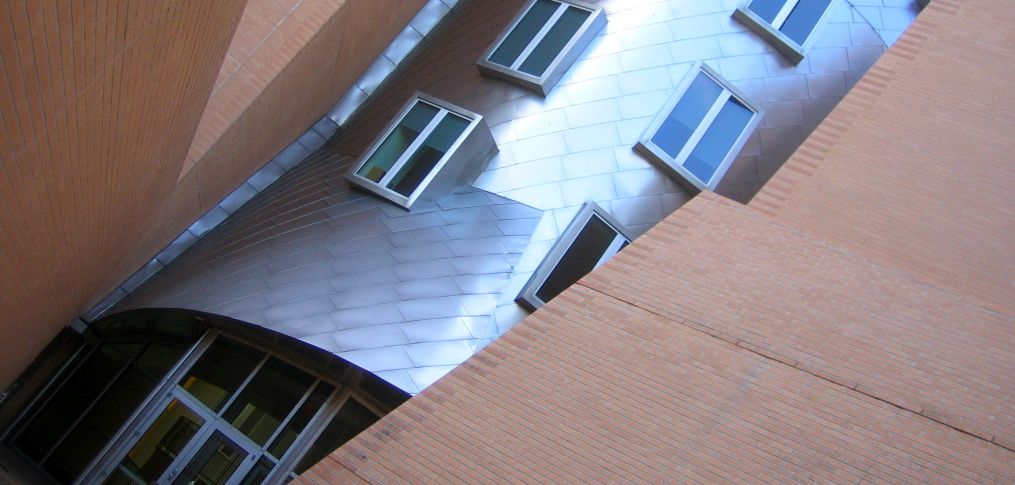
Stepping back a week to my last day in Boston with my friend Myron... He discovered that MIT was a trove of good architecture, so we spent the day wandering around campus. One of the first buildings we ran across is probably one of the most notable: Frank Gehry's Stata Center. The building jumps out from its surrounding streetscape and, to me, seems itself to be a snapshot of Gehry's evolving style. It fuses both of his trademark styles: chaotic straight-edged angles of metal and undulating flowing curves of metal. More than anything, it gave me perspective on how that latter style has developed and appreciate how refined that signature style had become by the time it was used for Disney Hall in LA; in contrast to his Music Experience Project in Seattle, one of the early examples of this style, which awkwardly doesn't work at all; and the Stata Center, which falls somewhere in between - both in timeline and refinement. At the same time, the Stata Center falls at the tail end of his angular styles, and those aspects seem to work very well in this application. Naturally a building like this isn't without controversy, and it seems to be equally loved and hated. It was a good springboard for our self-led tour. I'll feature other stops in future posts...

