
gaping hysteria
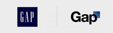

So many people have asked me to write about the Gap logo saga that I feel like I have to. Okay, you asked for it. My opinions on it may (or may not) surprise you. In a nutshell - its the Gap: a homogeneous clothing store found in suburban malls. They already had a bad logo. Why does anyone really care if they get a new bad logo? I'm a huge fan of social media, but the pile on reaction anytime anyone changes anything distresses me. "Oh my god Facebook changed its layout!" "Oh my god Twitter changed its features!" "The sky is falling!" Shut the hell up already. Take a breath, step away from it, work with it and get used to it. A week later its not so bad after all, is it? I'm not defending the design of Gap's new logo (or old one). And Gap's handling of the change and the reaction was textbook multiple-time bungling of public relations and marketing. Changing back to the old logo on Monday was the worst thing they could have done, in my humble opinion. By then, the fervor had finally died down. No one had even yet seen how it would be used on tags or apparel or stores. Live with it a while and quietly make alterations or changes later if it still isn't working. Perhaps quietly merge the old and new, as in the example above from Justin Skeesuck in a contest on Scott Hansen's ISO50 blog. That contest, if nothing else, proved that designing a better logo isn't so easy after all, based on most of the entries. (Of course, clients rarely choose the design you think is best anyway, so a contest like that doesn't have the critical 'client filter' aspect included.) And I won't even get into the patently unethical pratice of crowdsourcing or having a contest for a logo design that Gap said they would try - and then rescinded.
Businesses have to understand that making a change is always going to bring a visceral reaction at first. You can't kneejerk back in another direction based on initial reaction. The interwebs howled months ago when Sci-Fi network unveiled their new Syfy name and logo. "worst decision ever!" Today, nobody cares, their image is bolder and more consistent, and their ratings are up. The howl was worldwide when the London 2012 Olympics identity was unveiled. Today many (of course not all) in the UK have surprisingly found a connection to it after seeing how it used across a variety of applications and in context. And at the least, most begrudgingly acknowledge that it has established the London Olympics as young, vibrant, and distinct from other Games, which was the point all along. Turns out both knew what they were doing, initial reaction be damned. Go figure.
But back to my original point. Its the Gap. The old 80's/90's style logo was perfectly fine. It is a mediocre piece of design, and it works for them, but it isn't a hallmark piece of graphic design. This isn't United Airlines dropping their legendary and successful logo designed by Saul Bass that can be found in design history books and the almost 40 years of brand equity it holds. Or a brilliant piece of timeless design like Paul Rand's original UPS logo bastardized with trendy gimmicks that now already look dated. I don't shop in malls very often, so maybe I'm misjudging the personal connection people have with the Gap, but I found the hysteria and pile-on about the logo change far more ugly than the logo itself.
ISO50 Blog's Gap Redesign Contest
[update: just ran across this article by Eric Karjaluoto that makes a similar but much more well-written point:]