captured
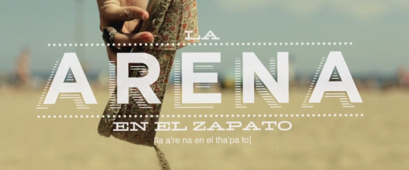
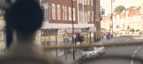
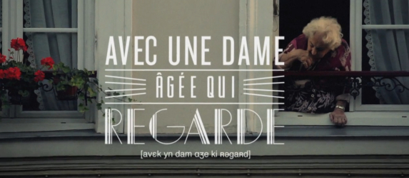
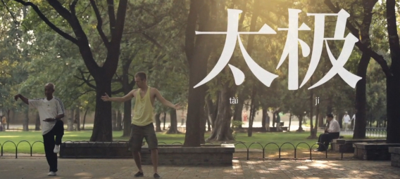
After seeing Scott Hansen's blogpost on these Friday on ISO50, I posted links to them on Twitter and facebook, but I still can't stop watching them, and think they deserve more attention. These are a series of spots done for EF International Language Centers, directed by Gustav Johansson, shot by Niklas Johansson, and designed by Albin Holmqvist. The typography in these is strikingly beautiful (as is the cinematography,) and as Scott said, any of the type frames could easily make a poster in and of themselves. The Barcelona spot is probably the best of the bunch typographically, but all are wonderfully smart and sensitive to their locales. But these spots strike on so many levels beyond design, especially for me. They accurately capture the very personal sense of adventure and discovery and meeting people that you experience in travel. This is brilliantly achieved by focusing on subtle moments, not grand scenes. Landmarks may appear, but they aren't the stars. These spots are all about personal moments. In the London spots, there is a shot of an intersection and a shot out of the bus: both really don't show anything in particular and seem like they could be accidental, but they actually expertly capture the light and surroundings, capturing the moment (its the same sense of moments that I often try to capture in my blind photography.) Similarly, the stories all involve subtle moments of connection between characters. (I think the Paris one my be my fav, but that may be my love for the city causing some bias. However, the spot does feel remarkably like what my time in Paris has felt like.) For advertising to work, it has to evoke an emotion. Its something we forget much too often. Thankfully, these guys got it right.

