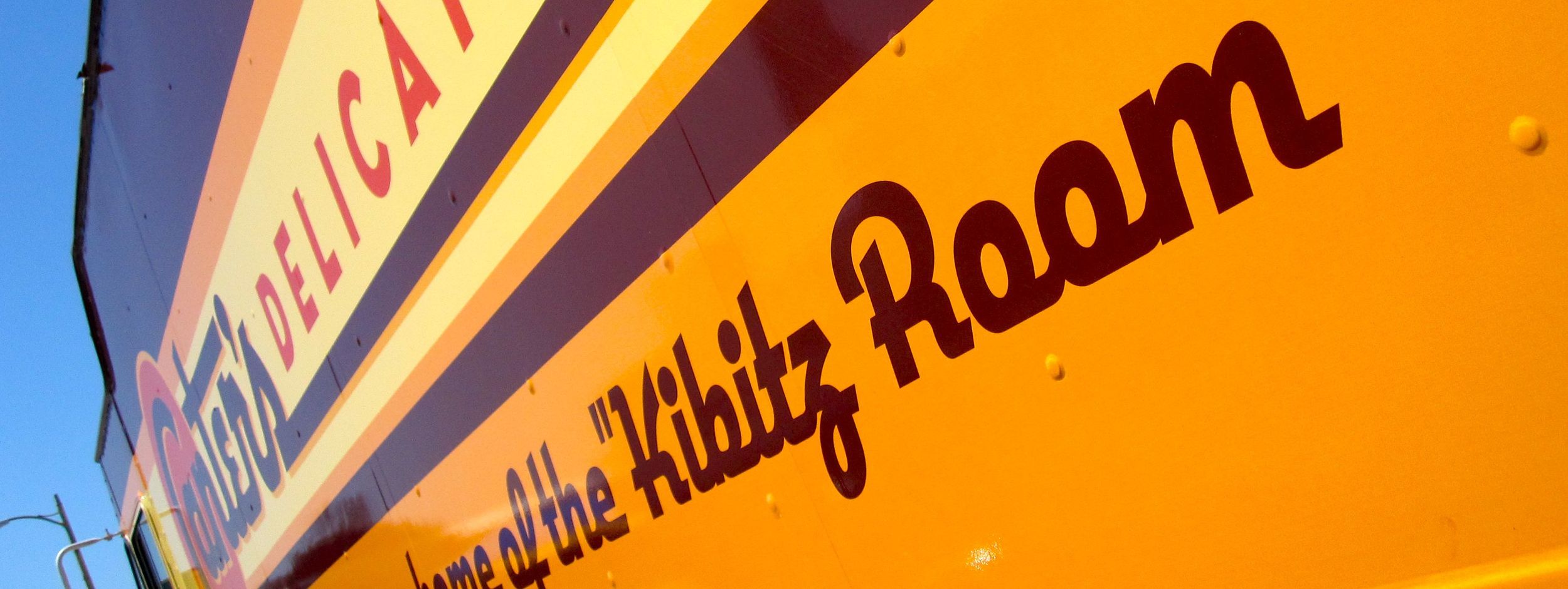
well scripted
When it comes to the graphic design of gourmet food trucks, there are a few well designed ones, and lots of pretty bad ones. Much like toothpaste or soda labels, food trucks seem to be full of overdone graphics falling victim to the desire to "make it pop" with no adherence to the rule of "just because you can do it, doesn't mean you should." But the well done trucks tend to stand out, and far and away one of the very best designs belongs to the Canter's Deli truck. At a recent outing among some of my beloved trucks, my friend Bill told me about the article below by designer Michael Doret, who designed the Canter's truck. It's an amazing story. Doret is a logo and type designer who designed a typeface called DeliScript that was (wait for it...) inspired by the neon sign over the entrance to Canter's. When Canter's was looking to create a gourmet food truck of their own, they found out about DeliScript, and instead of just buying the font, they tracked down the designer to design their truck in totality. And the results show it. There's a lot to love about the whole story, which you should read at the link below. My favorite thing is that even though the truck is a vinyl "wrap" (they have to be anymore,) he still designed the truck to look like it was painted. The details of how the wrap process works (and the way most trucks are designed to work with that) will make any designer who reads the article recoil in horror. Thankfully the truck turned out great and is a model of how intentional and well-thought design can make a difference - even on wheels.


