stylin'
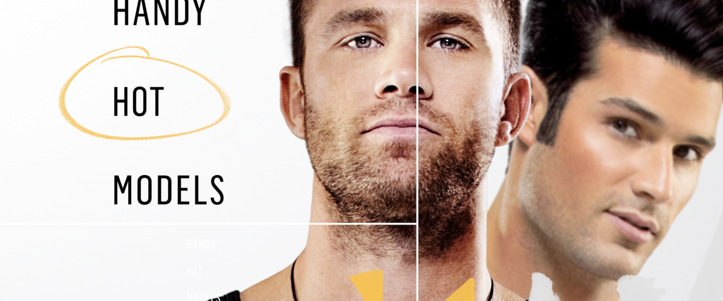
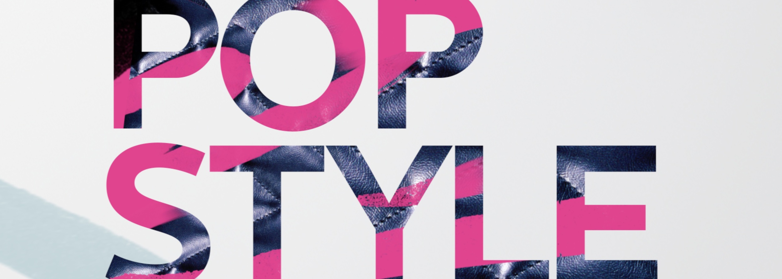
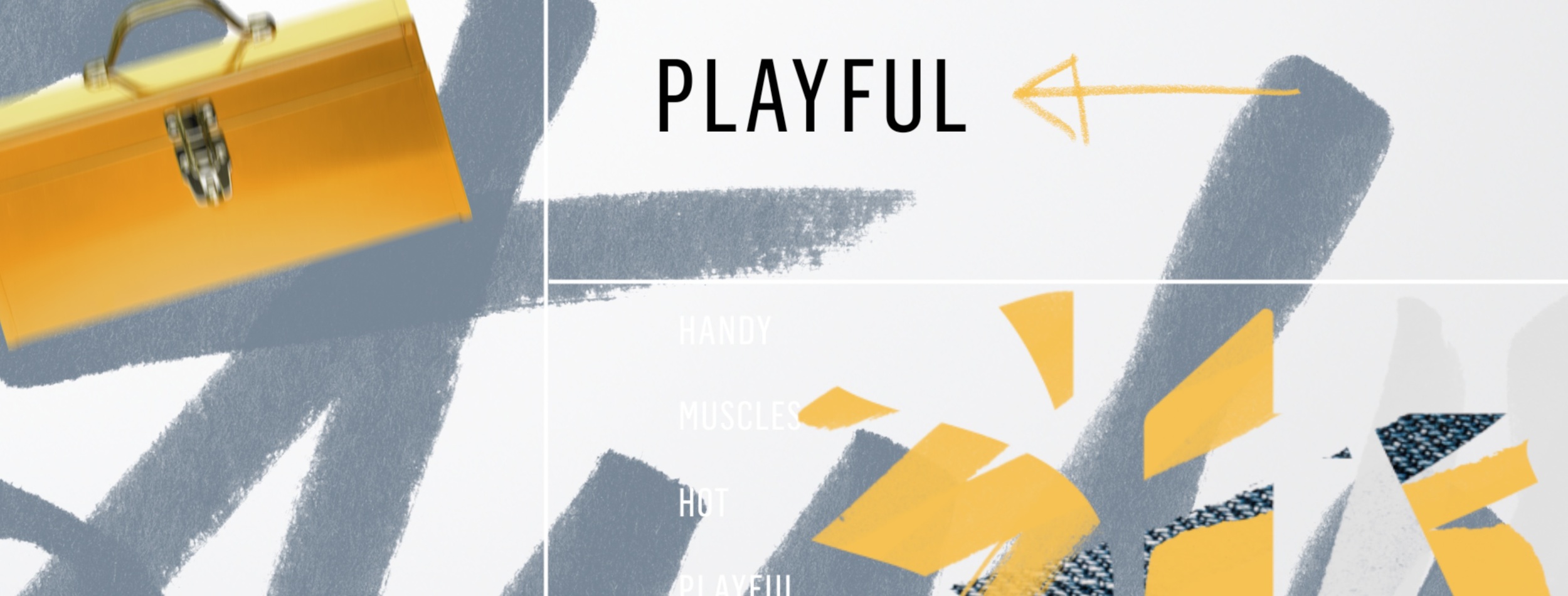
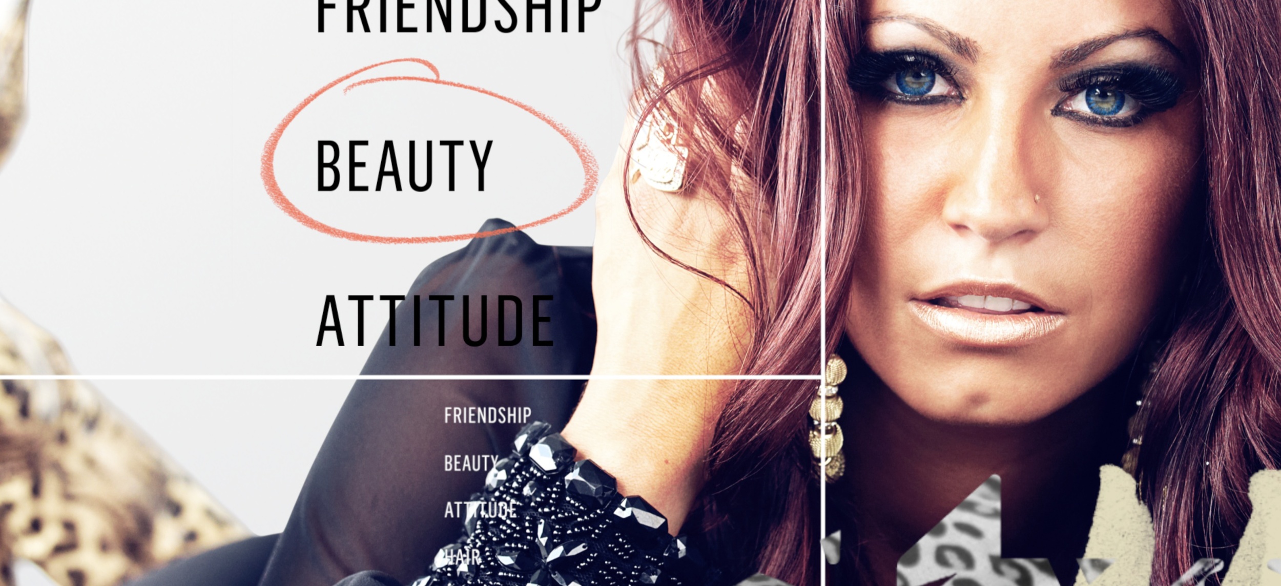
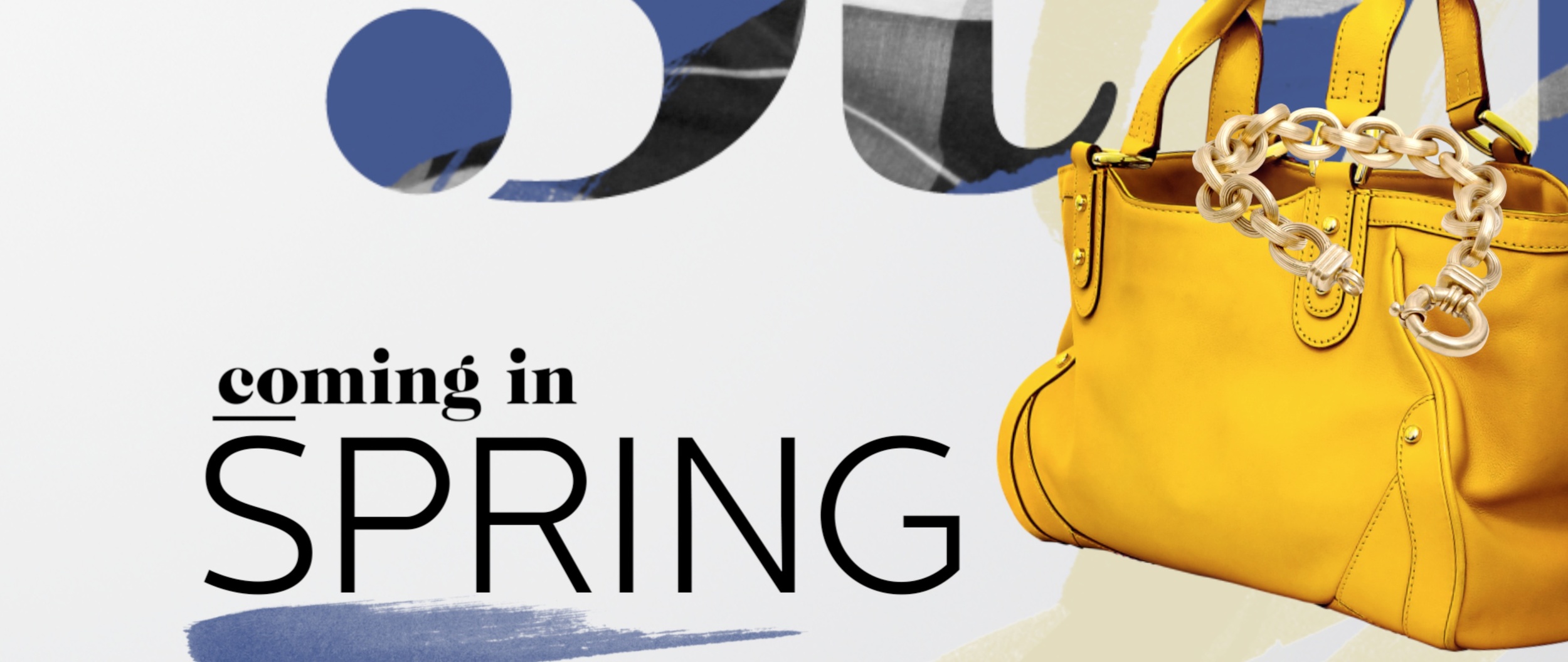
When working on a project that should be an extension of a network or shows existing look, its always a plus when that look is a great piece of design to begin with. That's a bit of an obvious statement, but its a rare and pleasant opportunity. So when Style Network contacted me about developing some pieces for their 2013 Upfronts, I was thrilled. Style rebranded a year or two ago, and their on-air look is a flexible, beautiful, and ingenuous package designed by Gretel. Its a playful twist on fashion and style consumers being modern hunters and gatherers - making lists, highlighting, marking and sharing what they like and want. Its the kind of work I see and think "God I wish I had done that." So getting to do pieces based on Gretel's original design and using elements created for that look was the next best thing. For the 2013 Upfronts, we adapted the look and elements to develop a package of 18 show-specific animations. These, as well as assorted graphic text cut pieces, were used throughout their annual video presentation to advertisers highlighting the networks strengths and offerings for the coming year. Check it out under 'featured work' or at its permanent link here: Upfronts • Style Network

