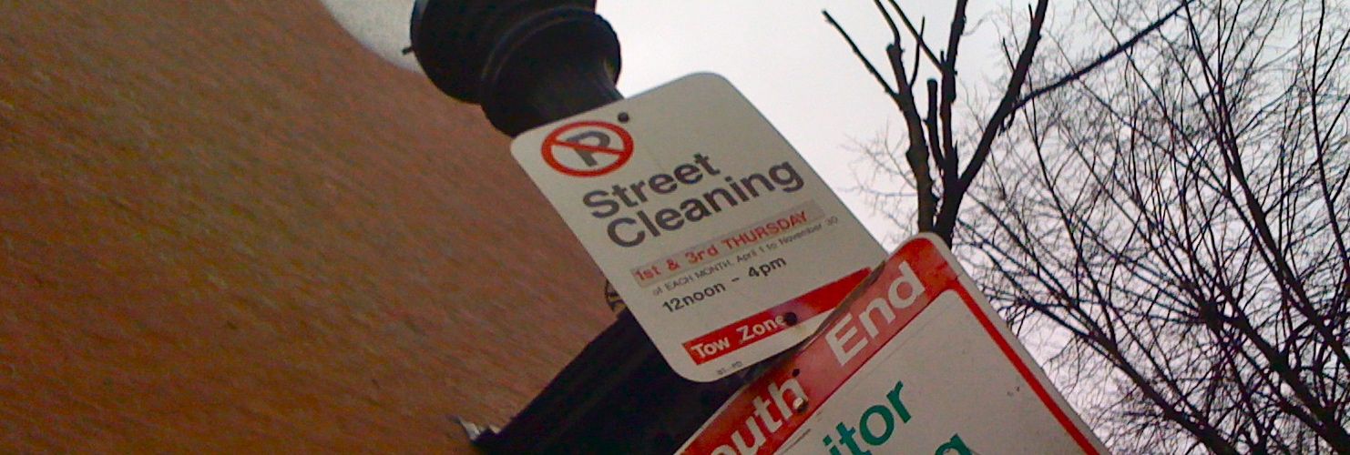
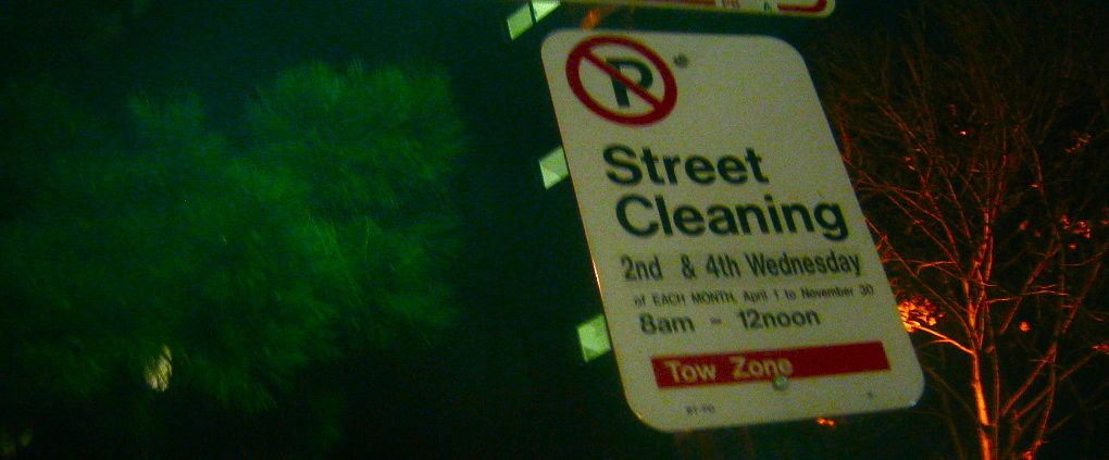
a good sign
Every city should have typography this good on city signage. These are from Boston (and in fairness, not all the signs, even on the same post, were this well done), but I love that the parking regulation signs were done in not only in Helvetica, but also flush left! Clearly a designer was working at some point in their office. Refreshing to see a change from the usually centered poor typefaces of your average street sign.


