
watch whats consistent


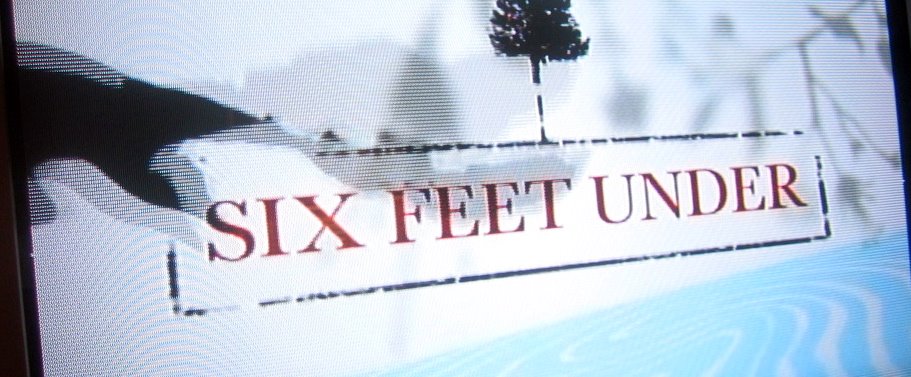
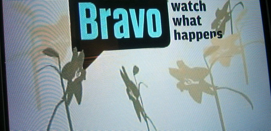
Bravo is running promos for the series "Six Feet Under" which will premiere in October. Bravo has a very distinct and consistent look - one that I don't love, but one that they have stuck to and used well and consistently. That is a bigger feat than it sounds. Network always come out with something new and big and special (in other words, everything new is always big and special) that someone in the chain of command decides needs to stand out from the rest of the things on the network. The pressure is usually to break the look for this special thing, then that special thing, and so on, and so on, until the look is compromised to the point that the network no longer has a consistent look. Bravo, say what you will about their look, hasn't done this - and Bravo to them for that.
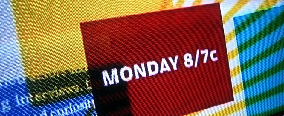
I would imagine that Six Feet Under posed a challenge for them - the Bravo look is very poppy, bright, colorful, bouncy - not adjectives you'd use to describe "Six Feet Under". However, the promo brilliantly used elements in a similar way that naturally fits as part of their look - but also fits the tone and subject of Six Feet Under. Consistency builds strong brands. Kudos for consistency.