
uncivil
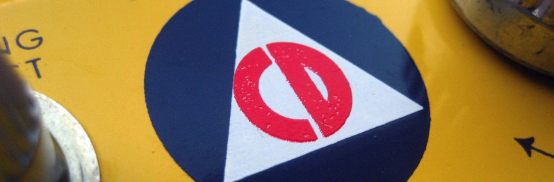

Another from the 'fixing something that isn't broken' department - it seems that someone in the National Emergency Management Association got the bright idea to drop the bold, strong, time-tested logo for Civil Defense, and replace it with, well, something that looks like a bad regional transit authority logo designed in a student art contest.
The old logo was designed in 1939 by Charles Coiner, the Art Director of NW Ayer advertising agency, who also designed the National Recovery Agency Administration's blue eagle logo.
Others can say it as well as I can: "The old mark fits the same category of simplicity and impact occupied by the London Underground map," said Richard Grefe of the American Institute of Graphic Arts. It was "authoritive and appropriate for the serious work" of civil defense, said Tom Geismar of Chermayeff & Geismar.
The new logo was developed by Morrie Goodman of marketing firm AGG International. He said the oh-so trendy swooshes symbolize movement (ugh), while the stars represent the local, state, and federal levels of disaster preparedness and response. And "Public Safety, Public Trust"? I think they stole that off of one of those god-awful Bush speech backdrops. Fittingly, the group the logo represents is the modern day heir to the Civil Defense Agency - yup, FEMA. "We now have a new symbol of what our profession is all about," said Goodman.
Personally, I'm calling for a moratorium of any more government design work as long as Republicans remain in power.
Heckuva job, Goodie.