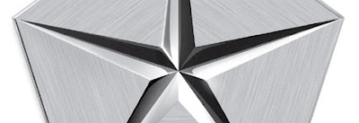
falling star


A couple weeks ago, Chrysler began its latest chapter as a new private company. They made the announcement with great fanfare over their new logo. What they may not have expected was the universal disdain and dislike that the logo would be greeted with. In addition, there seems to be great confusion over what this logo is even for. My guess - because I can't find confirmation anywhere - is that this is the new corporate logo, but not the logo that will appear on the vehicles. If that's true, thats the one good decision Chrysler has made. Several years ago, as Chrysler was releasing well-designed sleek vehicles and dispelling their boxy 80's K-car image, they began using the "wings" logo above. The wings logo is smartly built around the original Chrysler medallion logo from the 20's. It was a stylish logo change rooted in history. However, the "pentastar" logo that originally appeared in 1962 continued on as the corporate logo; (just not the logo used on vehicles). Again, a good move recognizing the equity of the pentastar that shouldn't be abandoned, while understanding a need for a new sleek public face on its vehicles. I can't believe Chrysler would be stupid enough to return to using the pentastar on its vehicles now. But then again, I also wouldn't have expected them to ruin the pentastar the way they have. Once again, its yet another case (a la AT&T, UPS, Chevron, etc) of a classic clean and bold logo being mucked up and muddled with additions of unnecessary shading, gradations, dimension, bevels, edges, blah blah blah. The flat logo that created dimension through a brilliant play on negative space is gone. "The new Pentastar, with some changes by Trevor Creed, Senior Vice President — Design, conveys strength and precision by fusing the ends of the five triangles to enclose the star and complete the pentagon." Holy crap. Thats the kind of mistake I would expect some marketing guy to make, but a designer? sheesh. I almost wonder if the message wasn't "We're closing the doors now - we're now a private company. We can do what we want and don't have to answer to anyone anymore." Clearly whoever did the accompanying typography wasn't answering to anyone. Borrowing the type from the wings logo just plain doesn't make any sense: its reference of a retro feel is completely out of place with the monolithic pentastar. And tacking "the new" on to ANY logo is inexcusable. Ever. If you have to say it literally with words on a logo, you haven't done your job. And to do so with such poor typography is even worse. Tony Spaeth of Identityworks didn't mince words in his review: "I have seldom seen so graphic an expression of how far we have fallen, in 45 years, from the skill and confidence of modern design. There is nothing in the new mark that is consistent with a corporation of stature and quality." It seems the new Chrysler has made its mark.
