the roundel


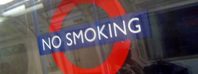
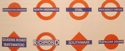
While in London, I noticed how many ways the Underground used their logo - arguably one of the best-known and most-recognized in the world. Station stops within the tunnels use the logo with the station name replacing the word "Underground". Elsewhere on the trains, directions like "No Smoking" are placed in the logo shape. Surprisingly, it works, and rather than confuse the identity, it reinforces it. It turns out that these uses, and even the logo itself, are not part of some planned identity design or strategy. London's Underground system (55% of which is actually above ground) began in 1863 as competing private rail lines. Later the city bought up the lines and merged them into one system. In the early 1900's, they started testing a variety of circle and diamond markers to identify various stops. The bullseye version was adopted for most stations around 1908, though a few continued to use the diamond. The use of the "roundel," as its called, for the Underground logo itself, was not adopted until the 1920's, but it has changed very little since then. It uses a custom font designed for the Underground called 'Johnston' after its designer Edward Johnson. Today, the system uses an updated version called 'New Johnston'. The logo is a perfect example of bold simplicity that firstly serves its purpose of marking locations but has grown to be a clear brand of its own to succesfully identify London's entire transportation system. Proof that simplicity breeds longevity.
