handy
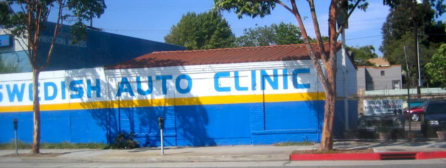
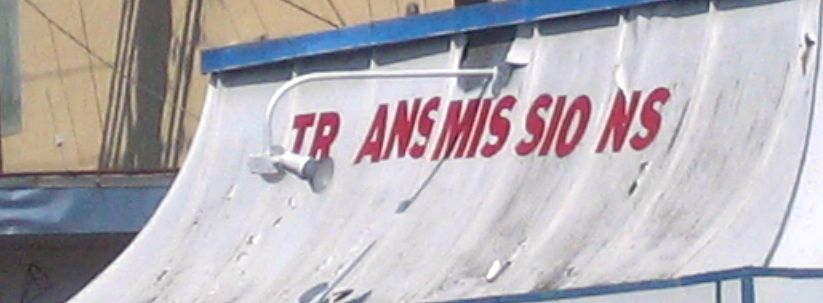
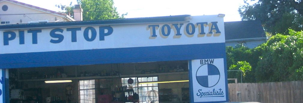
More hand-painted signage from along Lincoln Boulevard's stretch across Venice, Santa Monica and Marina Del Rey. I'm not sure what I like so much about these signs or why they seem so charming to me, because they (usually) are not examples of good typography. Part of it probably comes from the cumulative effect of so much of the street having signage like this (I would guess 50% or more of the businesses have some sort of hand-painted signage). Probably more than anything, I find them charming because they don't pretend to be something they aren't, or they don't try to pretend they are better than they actually are. There's something refreshing about that.


