
Night Moves

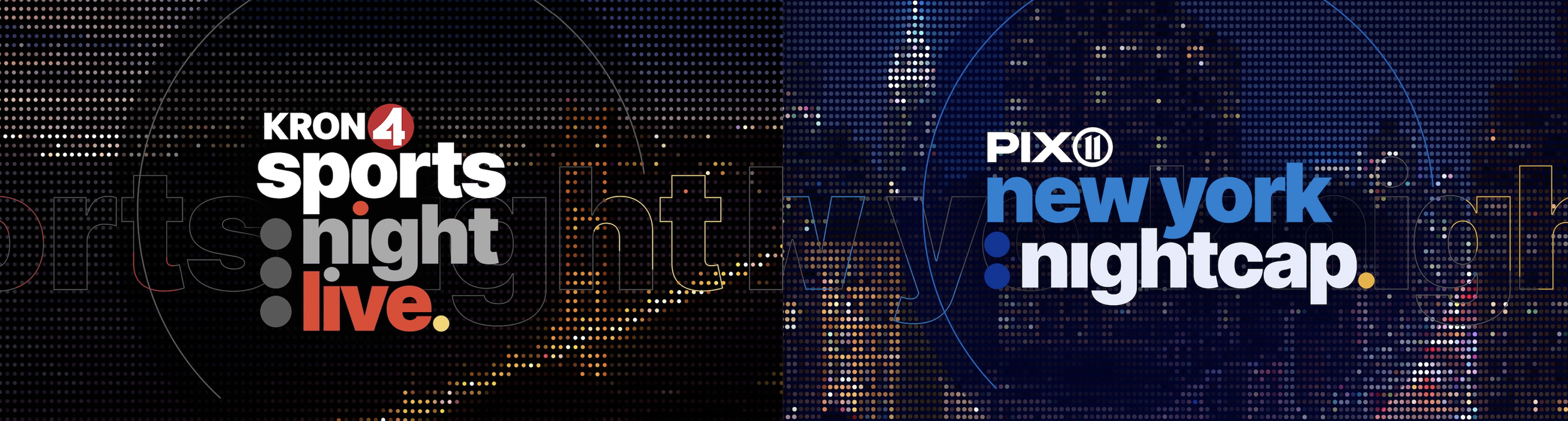
When San Francisco’s KRON4 rebranded with their Circa news graphics package, Creative Director Matt Damore asked me to redesign their late night sports show, Sports Night Live, which at the time lived within the newscast. The challenge was to build it using the same architecture and layouts, but still give Sports Night Live its own identity.
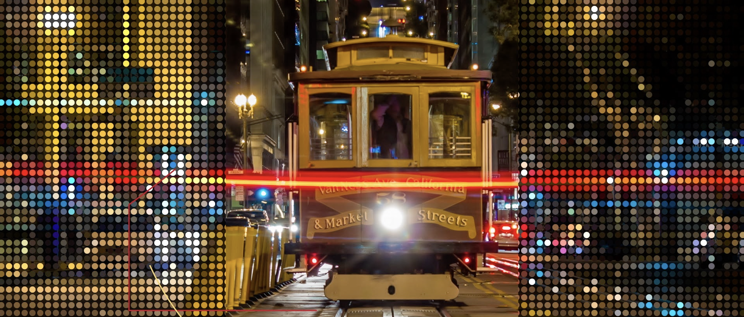
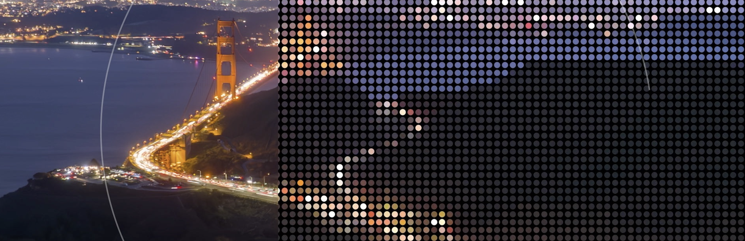
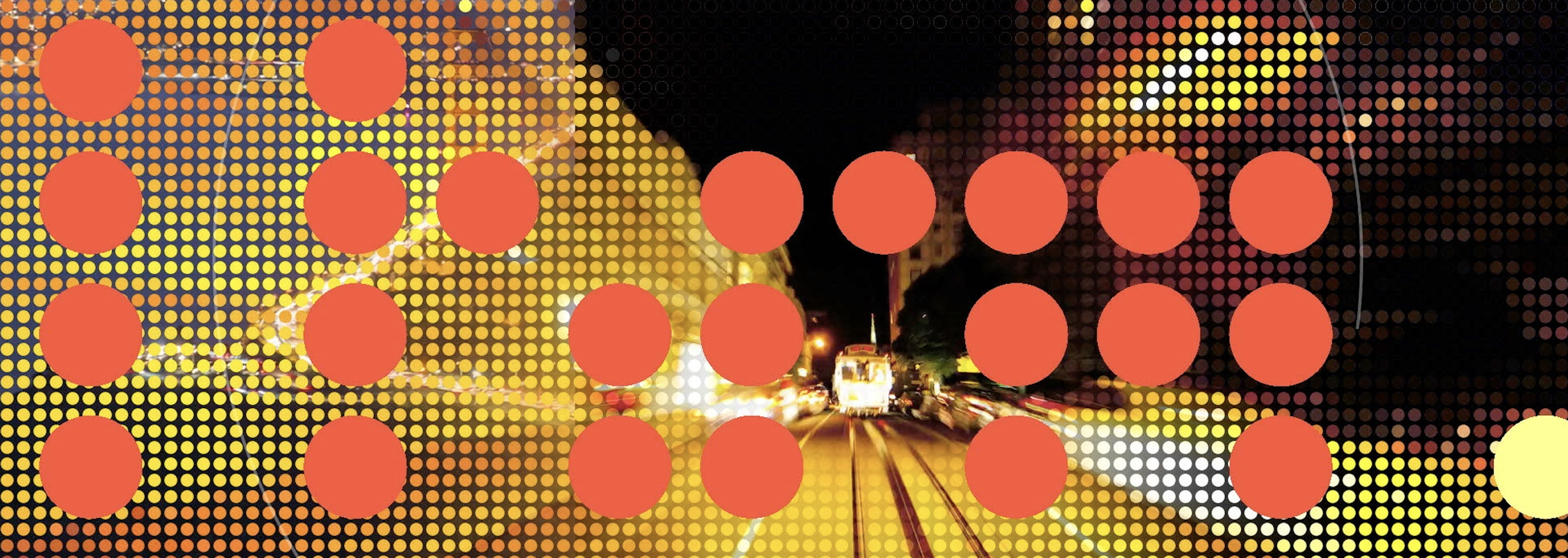
One of the first ideas was to build on Circa’s existing dot patterns and push them into something more specific to sports. I wanted them to feel like a scoreboard - dots as pixels, each one carrying a value of light or color that together form an image. That became a core texture for the package.
A major constraint early on was that no sports team logos or game footage could be used. (The issue is rights and sponsorship structures - since the show carries advertising and sponsorships that can conflict with team and league agreements.) For sports fans, their team represents their city, and sports fandom is often tied pretty closely to civic pride. So instead of building it around teams, I decided to represent the city directly.
As a late-night sports show, night imagery was a given, but the use of time-lapse footage added a key element, with freeway light trails, street movement, and city activity adding the kind of energy and excitement that defines sports. That carried through the package that launched with the KRON rebrand, and Sports Night Live had a refreshed identity and new energy.
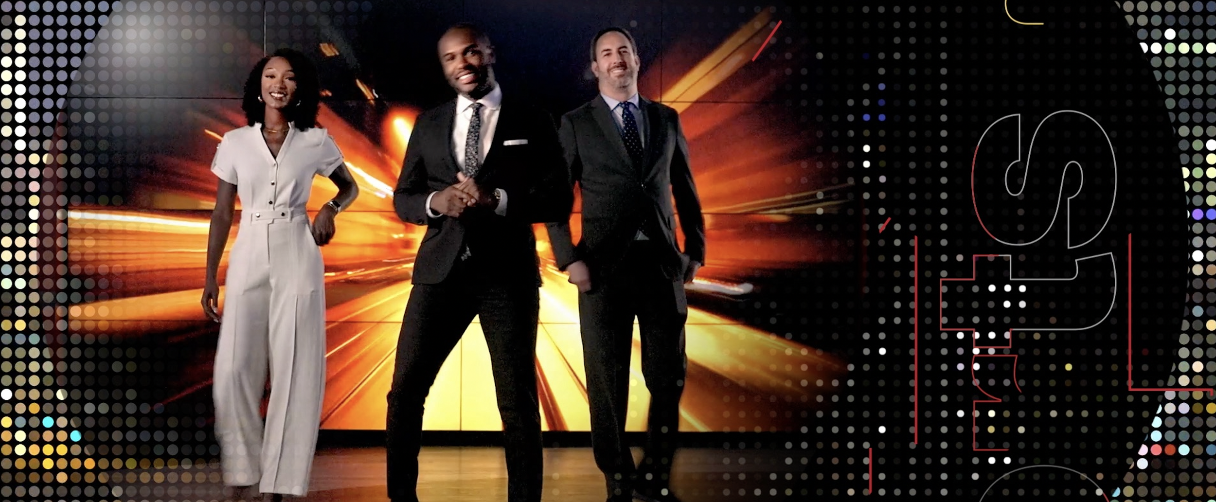
A year later, PIX11 Creative Director Court Passant reached out about their soon-to-launch nightly sports show, New York Nightcap. The ask was simple - could I take what was done for KRON and translate it to New York City?
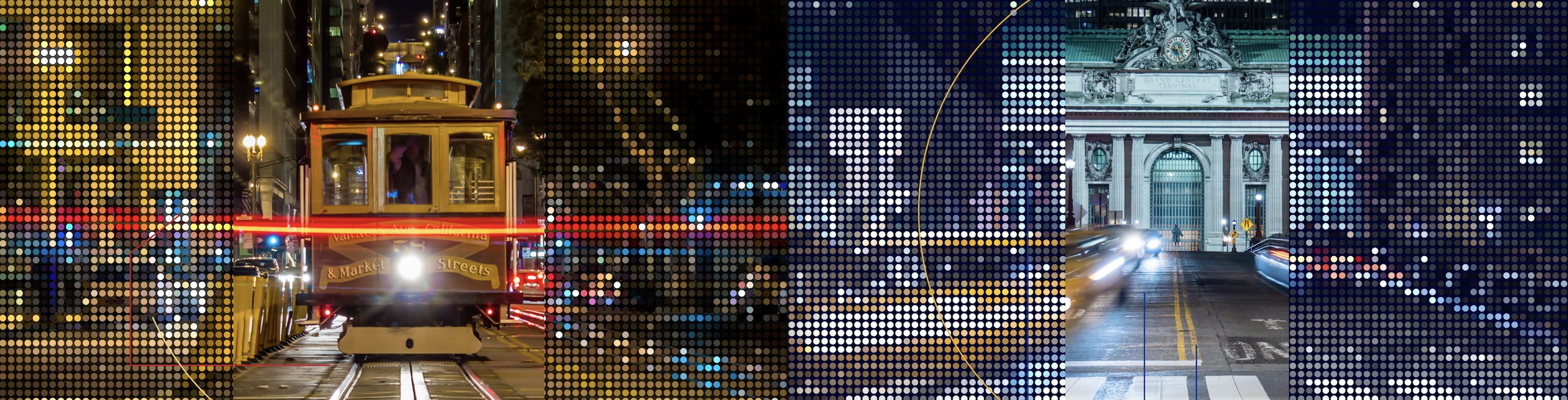
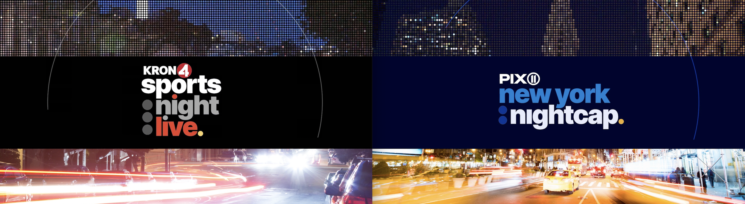
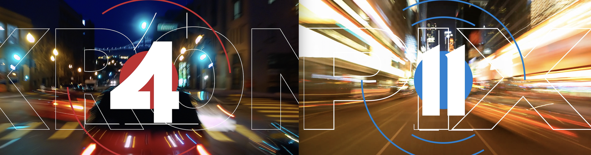
One of the challenges was that the footage-based package was hyper-local and packed with tons of specifically local scenes. That all had to change. Adapting it to New York became a hunt for similar footage or views that could replace shots from the original package, which wasn’t ever really built to be customized in the first place. One of the best moments was stumbling on some timelapse New York driving footage that had pops of yellow taxis that made for a direct match with the original ‘lucky find’ of San Francisco driving footage that featured pops of cable cars. So San Francisco’s cable cars, freeways, and bridges became denser layered cabs, skyscrapers, and landmarks. And blue. The palette also shifted toward blues to align with PIX11’s branding, which changed the overall tone fairly quickly.
In the end, NightSpeed really ended up being less about sports branding in the traditional sense, and more about how sports identity maps to place.
Both versions of NightSpeed are now on air, built from the same framework but shaped entirely by their own city.
You can also check out a combo reel of the look here: Nightspeed graphics package