all night all right
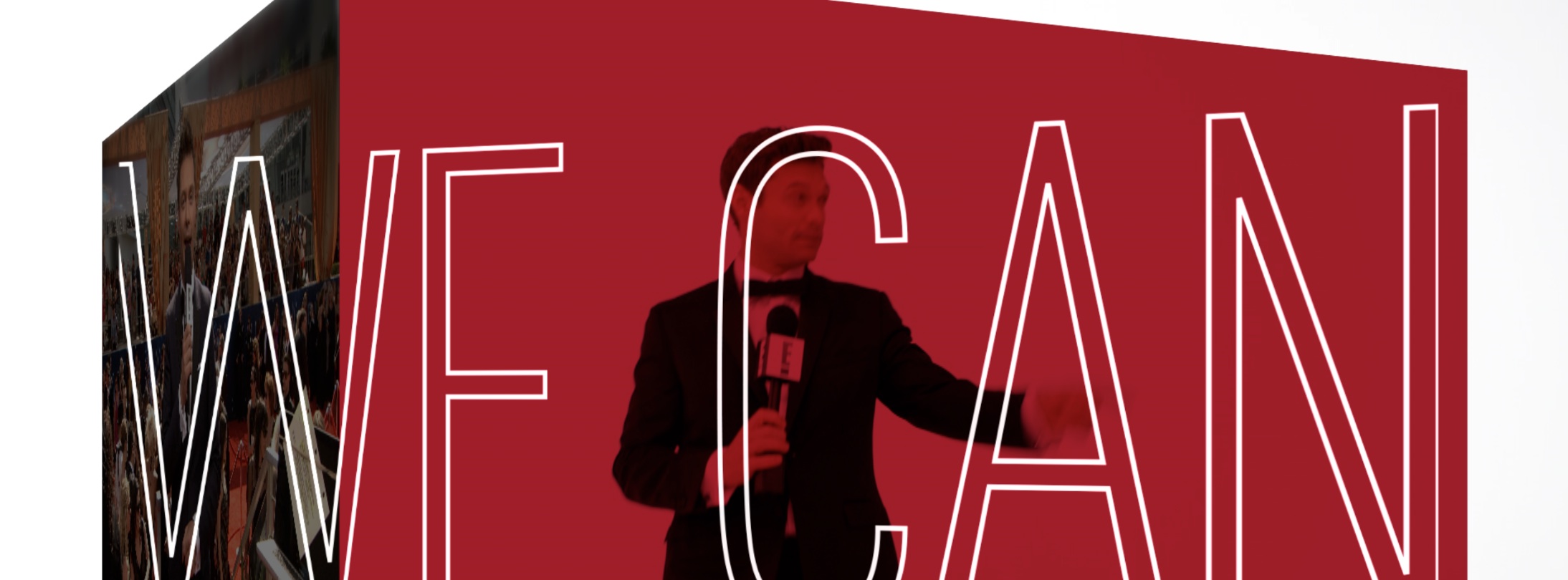
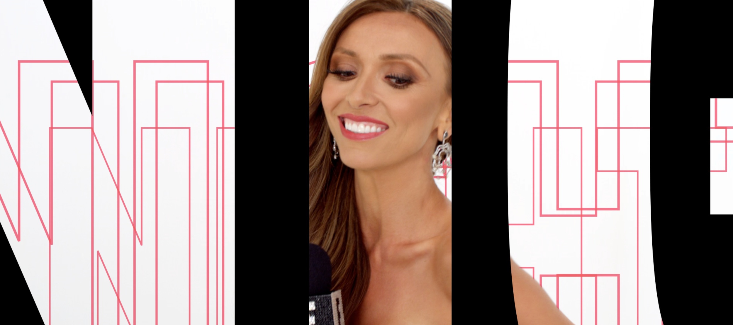
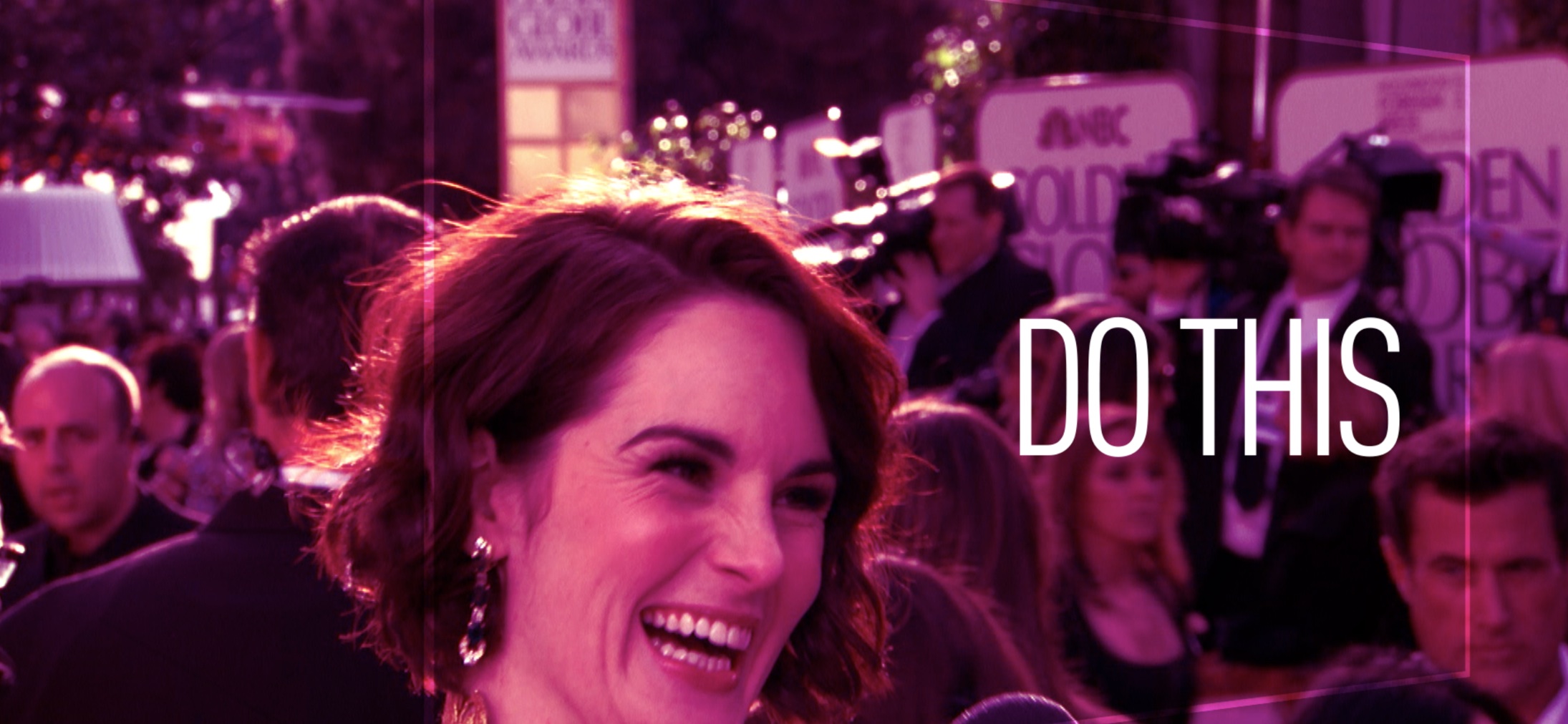
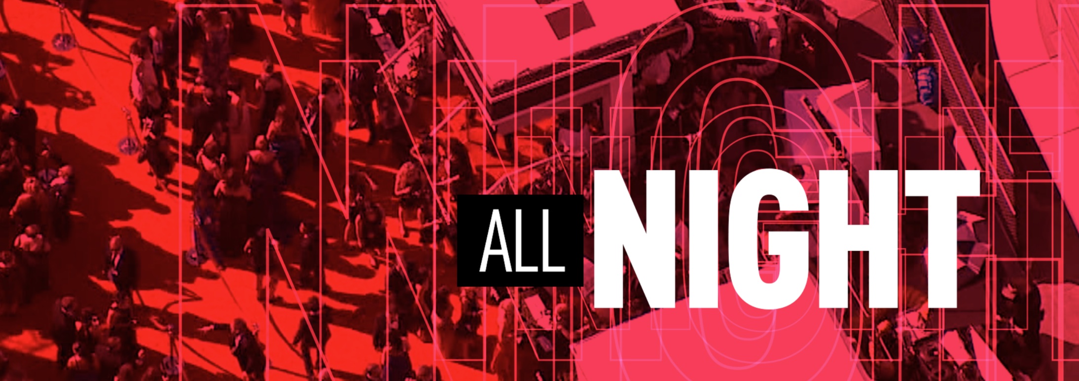
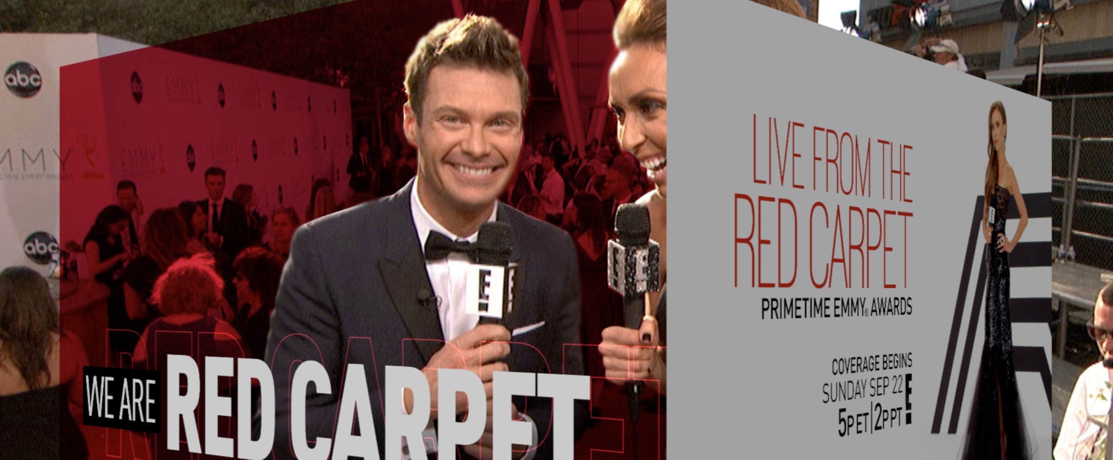
For the last year or so leading into and since their rebrand, I've done a lot of work with the folks at E! It doesn't hurt that I love what they've done with their brand, or that they're some of the nicest people I've ever worked with. (Yeah, okay, enough of the love-fest.) A few weeks ago they called me with a fun project that was a little different than a few crime-edged show packages I'd recently done for them. This project was a promo look for their "Live from the Red Carpet" coverage for the Primetime Emmys. They had licensed the song "All Night" by Icona Pop and wanted a look that was equally upbeat and energetic, that would look and feel like E!, and capture the party vibe of their coverage. Their rough cut was heavy on typographic elements (yay!) and opened with a cube transition reference to their mic flags they hoped I could use. Every designer groans at what we call canned "switcher effects" like a cube transition, but it ended up turning into something we really like. By deconstructing the cube so that it became several layers moving in opposing directions while keeping the "subject" layer stationary, it now carries some level of surprise. A linear version of the cube also references both camera shutters and the E! signature "GlamCam360" spin while motivating movement into transitions or animation. The other primary element is what came to be called the "echo" - outlined typography that repeats itself toward or away from camera in layers meant to reference the extensive ongoing coverage - and thus the main theme of the promo, "we can do this all night." (I'll confess I was pleasantly shocked when they didn't bat an eye at my giving that treatment to their logo.) Other secondary elements include larger than life typography that works as windows to the activity happening on the red carpet, as well as linear bands of red that represent the carpet itself. I'm calling the version that I posted here the "Directors Cut", but theres only one shot difference from the final. A white studio shot was replaced by footage of the hosts on the Carpet; they rightly felt it more important to show their hosts in the Red Carpet context, and I agree with their call on that, but just wanted to show this version because I love how that shot works purely from a design standpoint. Check it out here: We Are Red Carpet


