
design light

This forum has become a travelogue of late, and even before coming to Europe, it still had become more of a personal journal than I ever expected it to. I did however always try to include some design-related content occasionally, often with nod to good (or bad) design.
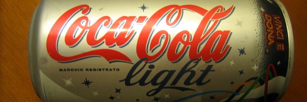
I don't drink coffee, but I do drink diet cola like a fiend. I'm a Pepsi guy (the 'choice of a new generation' campaign and the logo redesign that accompanied it still rings true to me), but I am just as happy to down a Diet Coke. In Europe, Diet Coke is Coca-Cola Light. A better name, I think, when diet drinks have always tried hard to be palatable to a male audience. (There must be a marketing reason though - remember Diet Pepsi began as Pepsi Light in the states, it still is Pepsi Light in Europe.)
More notable for Coca-Cola Light is the logo. I have never felt that the diet Coke logo worked. Its clunky and awkward and just doesn't fit. The Coca-Cola typeface is terrible as a font for long bits of copy, but as a logo itself, it has been refined over the years to be a true thing of beauty. Coca-Cola light simply uses the same typeface tucked neatly and pleasantly in with the Coca-Cola.