diamond in the ruff


One of my biggest design peeves is graphics for sports. Often good design may be found in marketing for sports teams, but when it comes to stadium on-screen graphics, not to mention sports broadcast graphics on television, they are sometimes the worst. In an application where large amounts of information need to be communicated clearly, its common to see terrible typography and design that goes so overboard on overly complicated elements that it gets in the way of the information.
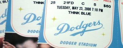
The Dodgers are somewhat of an example of this phenomenon this year. As a Dodgers fan who goes to a lot of games, the on-screen (jumbotron, videostripe etc) graphics have always been a peeve of mine. Dodger Stadium itself was renovated this year and returned to its original color scheme, which is frankly and odd combination of teal, pale yellow, and pale orange - but hey, those were the colors. The Dodgers have continued this color scheme with a retro design look on their advertising, the tickets, banners and signage all over the stadium, even the dugout. (Most interesting in this is that they have used a different version of the Dodgers logo itself on this year's materials. I don't know if it is an actual old version of the Dodgers script or not, but I do like that they took that risk with the logo. The true logo remains on the stadium, uniforms, etc.) However, the design ends with the signage and banners. The video screens and strips have a look with no connection to the experience that carried you from your ticket to your seat. It is a typical overdone sports look in all ways. Overdone backgrounds with hundreds of meaningless flying elements, clunky spinning words, and truly astoundingly bad typography used for stats on the jumbotron. Could a designer have played a role in this? Its a curious thing, and sadly, a common one. The retro design has its faults, like some curious type combinations, but what a great opportunity to carry that experience through all elements of the game. This is what packaging is. It could have been a home run, but I guess a double is better than a strike out.
Nonetheless, Dodger Dogs still rule.
