
when bad is good


This is not meant in any way to make light of bad things happening, but one silver lining (especially being somewhat of a night owl) to big news breaking overseas in the middle of the night is that CNN usually just takes the feed of CNN International.
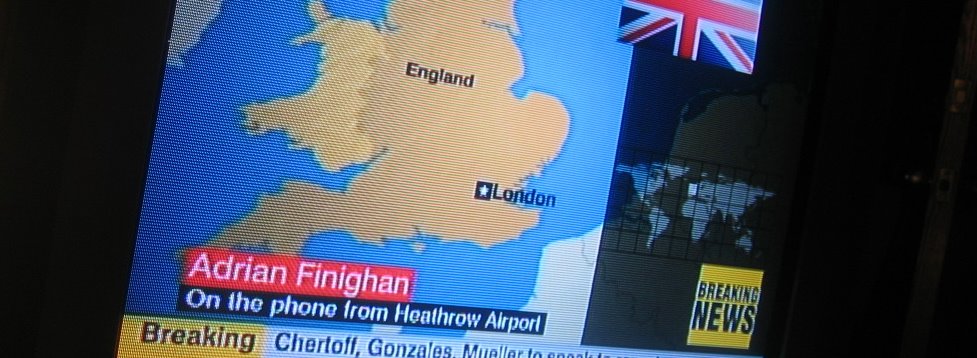
I wrote about CNN International's design a few weeks ago, but I felt the urge to give them kudos again after seeing the coverage on Wednesday night.
Designed by Kemistry, CNN International is far and away the best-designed news outlet that I've ever seen (another worthy example is the former look of ktla here in Los Angeles, designed by Linda Kane). It is the perfect example of how good design can work for news - not only to look good, but to help communicate, which is what design is supposed to do in the first place. It is clean, clear and consistent, even to its use of a grid system for every screen layout. I could never see an American network having the strength to go with such a look (even the US version of CNN), but it is a joy to get a glimpse of just how well it works every now and then.
By the way - notice the lack of special "Terror in the Sky" etc graphics? CNN International actually gives its viewers some credit and doesn't insult their intelligence. Imagine such a thing from an American news network or station.