harmony
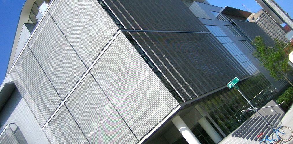
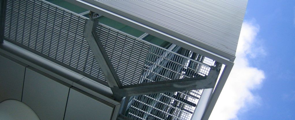
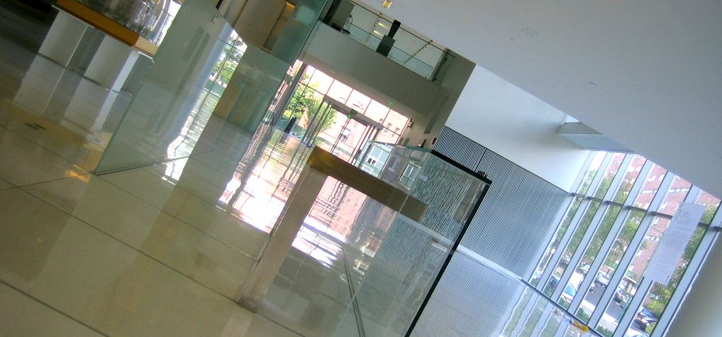
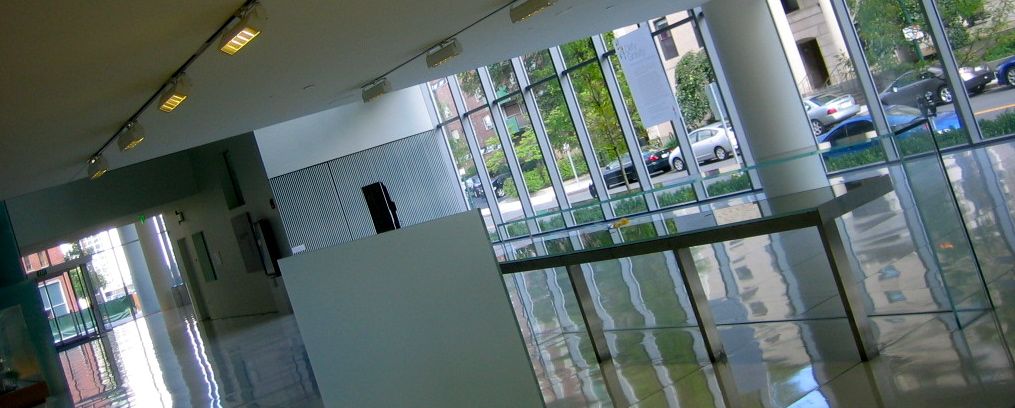
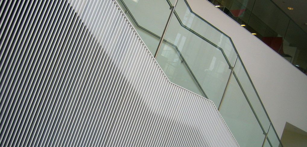
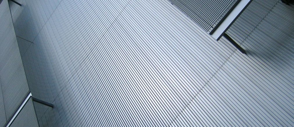
Continuing on our self-made tour of MIT architecture while in Boston, Myron and I stumbled upon a building that wasn't on any of our lists, but the minute we saw it we stopped in our tracks. The exterior was wrapped in a strong but elegant sheath of metal rods and we stepped inside to a shiny but cool and bright environment. The low ceiling of the entrance and exhibit area opened up to a dramatic open space that showed the work happening in the spaces within. We discovered it was the Media Lab Extension building, designed by Maki and Associates. There's a lot to love about this building and its feeling of open glass, but what made the biggest impression was that sheath of metalwork that allowed it. It turns out that Cambridge has a building code that dictates that building perimeters cannot be more than 50% glass. The architect used bamboo screens as inspiration to come up with a solution that allowed for a full glass openness while simultaneously providing shade and privacy. Its a beautiful and strange harmony of contradiction.

