fixer upper
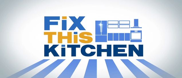
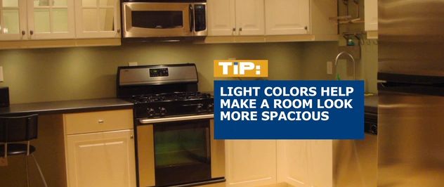
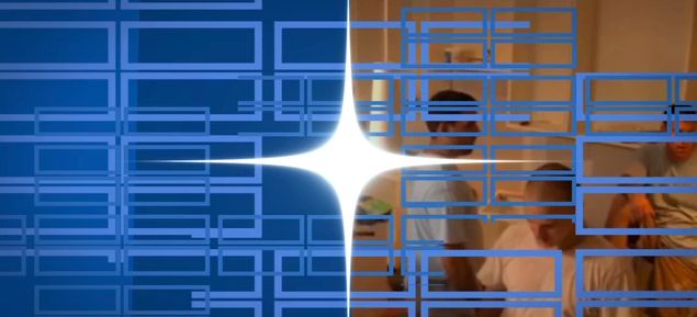
Some more recent work that's now airing on A&E was posted on jonberrydesign.com last weekend. "Fix This Kitchen," produced by MEC Entertainment with RIVR Media, is a new show where celebrity chefs surprise homeowners with a complete kitchen makeover. The graphics package for the show features a clean, modern and modular system to reflect the shows partnership with Ikea. Typography and color palette choices also were conscientious to tie to that partnership. Early look concepts were originally inspired by film titles of Maurice Binder and Saul Bass. That inspiration carried into irregular shapes and angles throughout the look, but that retro feel ended up being a conflict to the sense of a new and modern kitchen. We revised the elements to be modular shapes that always used clean right angles, much like in a modern kitchen. A similar problem came in the open where transitioning from scene to scene in the style of Binder or Bass made the new and old kitchen feel like two unrelated kitchens, so the resulting open veered from being a more direct interpretation of those influences but kept that style as the look's point of view. The look's modularity carried over to the palette, allowing most elements to be delivered in both colors, creating a mix and match system that could be used for variety in the production of the show. "Fix this Kitchen" airs Saturday mornings on A&E, or you can check out a reel of the graphics package on my recent work page:


