
marks of time


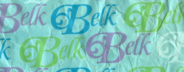
Paul Galbraith, a designer I follow on Twitter, recently posted about logos that were designed the year he was born. I thought it was a clever idea and decided to steal it for a post of my own. Here are some I was able to find from some Google searching - so results may not be completely accurate, though these are all examples I found in more than one place. First off, the Apple logo. No, not that Apple, this is Apple Corps, the record and publishing label tied to the Beatles. I think I still have 45rpm records with this logo on the label (the b-side of the record showed the inside of the apple.) Also from 1968 is the Continental Airlines logo designed by the legendary Saul Bass. This logo holds up today even better than the logo Continental currently uses, a good sign that they never should have changed their logo. Another timeless classic from 1968, the Major League Baseball logo. And less timeless, but fun nonetheless, was the Montgomery Ward logo - one of many in its history, but this iteration debuted in '68; as did the logo for Belk (and sister store Leggett,) a chain of department stores in the South, which just rebranded with a new logo this year.