soft gets fresh
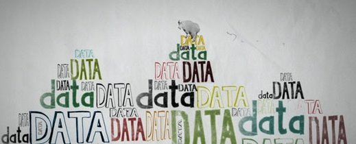
A couple weeks ago while watching tv, among the high gloss financial and investment commercials was one that caught my attention. First off, the animation was beautiful, unique, and fun. The copy was smart, and the sound distinctive. Clearly it was a business-aimed spot, but nonetheless, it was a joy to watch. And it never mentioned a product, only ideals - until the logo at the end for Microsoft. Wait - Microsoft??? Srsly?! They're not exactly known for good advertising or design. The spots were done by design firm Imaginary Forces for ad agency JWT, and directed by Michelle Dougherty. The animation is smart and playful, feels tactile and homemade - decidedly low tech. I particularly love the sound is also done to feel low-tech, as if recorded over a phone. Its a distinctive move for a company that would never be associated with that word. Points to them for this one.


