progress
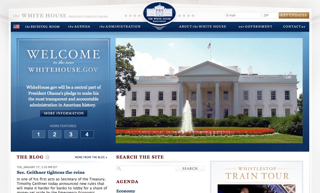
Among the changes that you may not have noticed in the change of administration is the revamped website for the executive branch. Whitehouse.gov has gone from the 90's style website to a deeper and more interactive site, but more importantly, one that was actually designed by a designer. Information is presented clearly with strong hierarchy and a strong but refined style. It takes clear clues from the Obama campaign website, from its calls to action and features, to its palette and typography. Though the campaign's signature san serif face Gotham is not used, the serifed face that was used a secondary face has now become primary. While not revolutionary, its an interesting update. And elsewhere on the web, in a similar but unrelated move, the image of the Vice President's residence on Google Maps has gone from being obscured to clear. Go figure, huh?


