
the art of the background
Sometimes the hardest thing to design is something that's not supposed to get noticed.
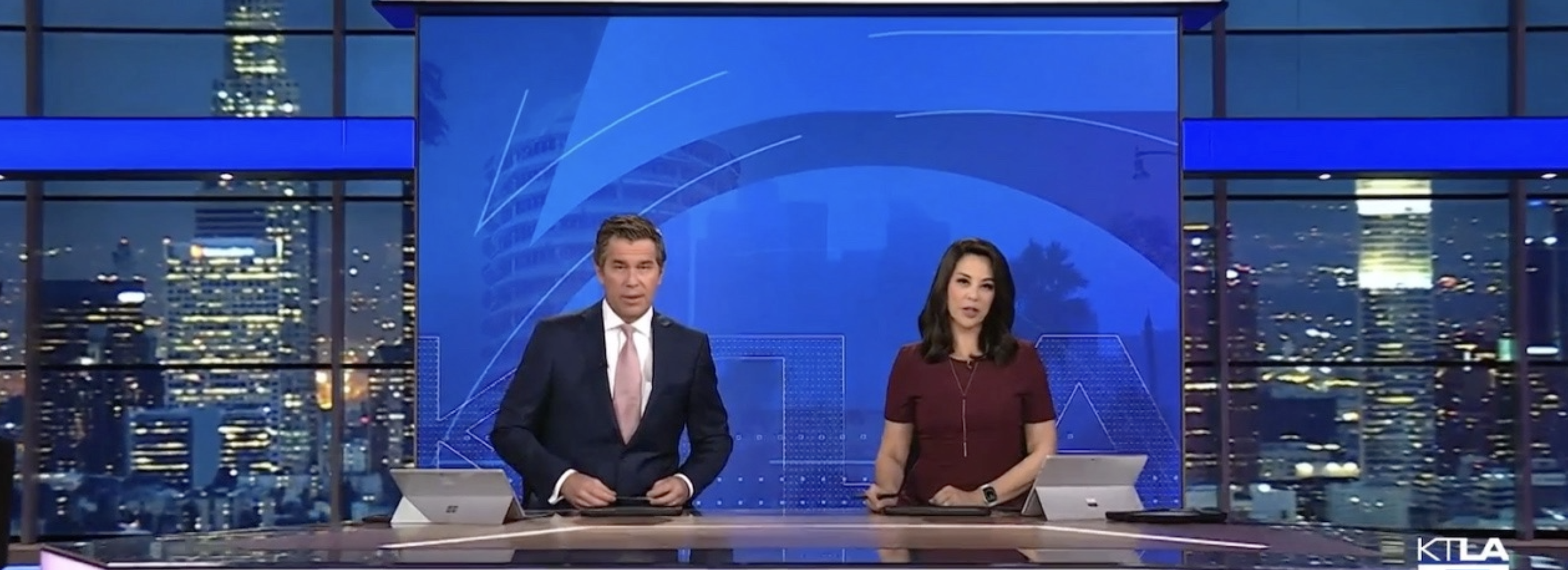
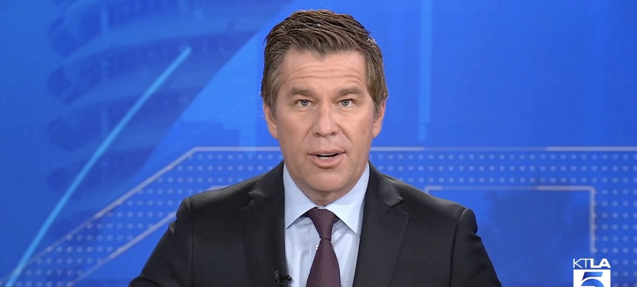
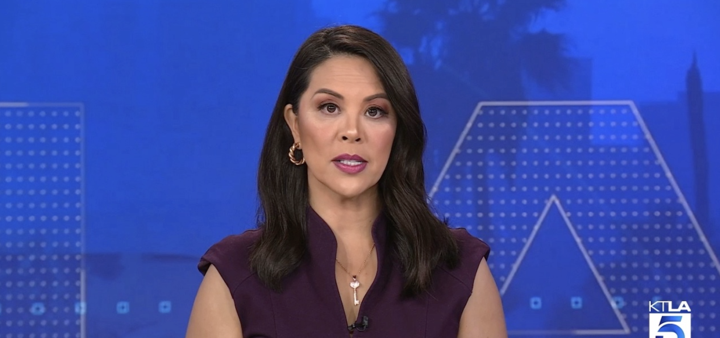
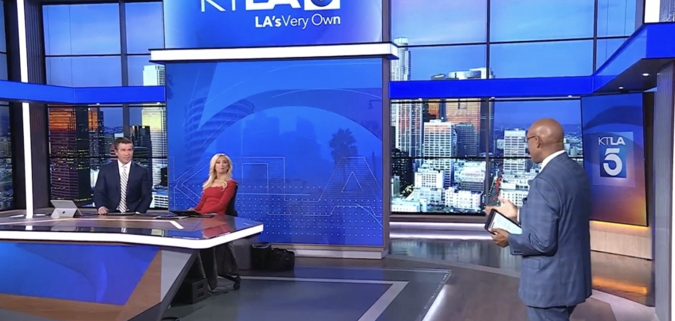
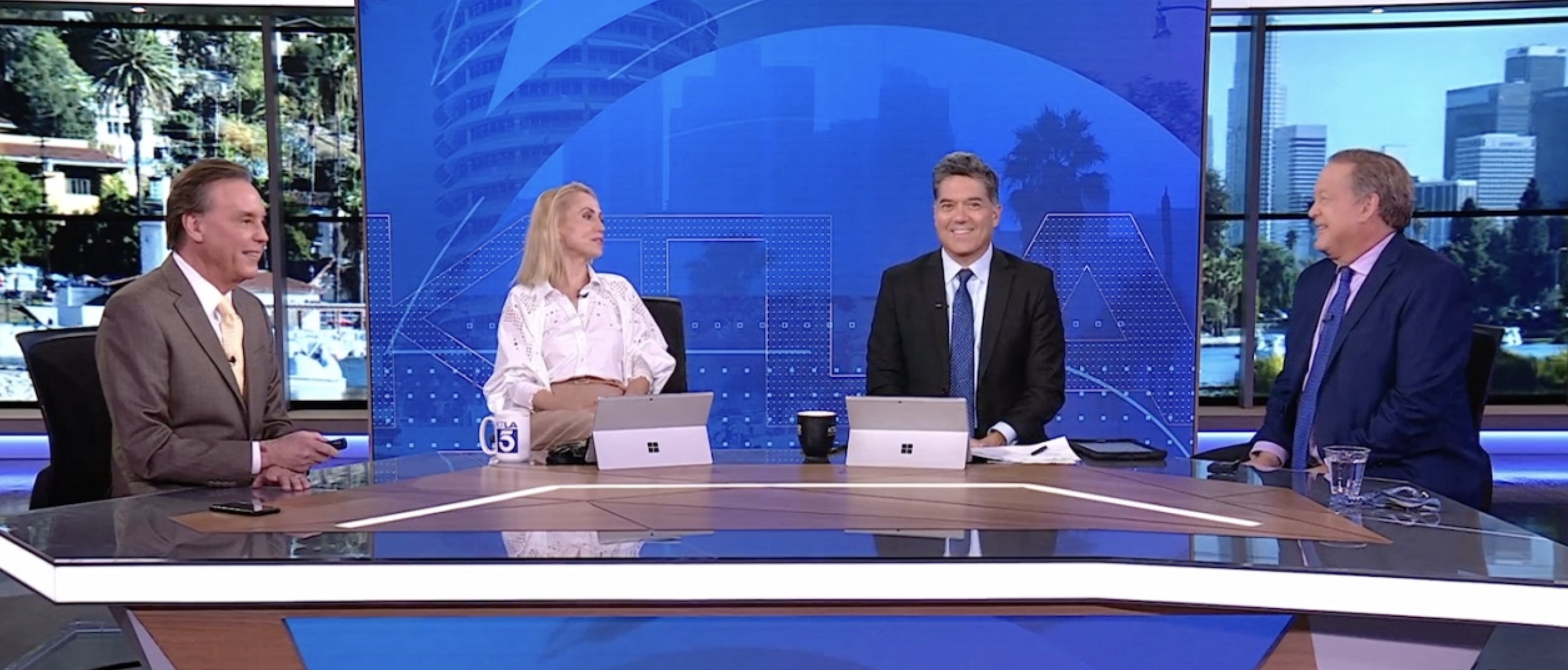
When KTLA debuted their new newscast studio, they called me with an interesting challenge. The set's large center video wall would fill the frame in close anchor shots, but become part of a much larger composition in wide shots, opening up to reveal scenic background monitor walls that would feel like windows, matching the time and weather.
The center wall needed to walk a fine line. They didn't want a basic station logo, or another scenic background due to those other “window” walls. It needed to work for every newscast and daypart, have enough visual interest to feel alive, but remain subtle enough not to compete with the anchors or feel repetitive. And, of course, it needed to feel like Los Angeles.
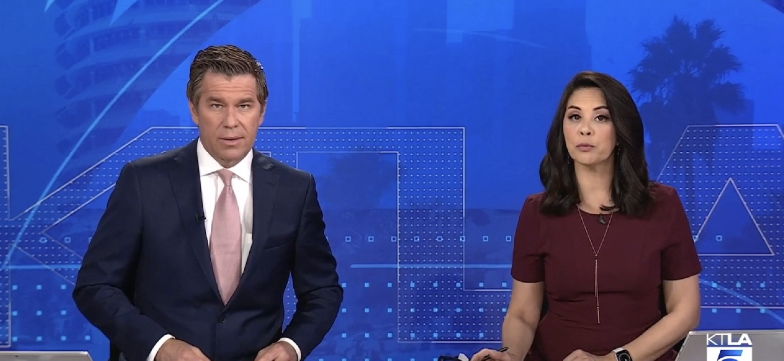
Art Director Estella Medina and Senior Design Supervisor Kevin Bolyard quickly responded positively to my first sketches using an oversized, cropped version of the station's signature 5 logo as the foundation of the design. The enlarged curves could read as abstract graphic shapes in close shots, while resolving into the recognizable 5 in wide shots, without becoming a complete logo. I added a treatment of the KTLA logotype letterforms filled with gold squares and accented by traveling highlights, along with layers of blue square patterns for added texture and movement. These elements were carefully positioned to stay at or below the anchors' eyelines, keeping most of the motion below shoulder height. Even the traveling highlights that echoed the large 5 shape were kept clear of the anchors' heads.
After experimenting with abstract rolling textures and a blurred, simulated newsroom-style wall of monitors to fill the 5 shape and surrounding space, I revisited an idea we'd initially been trying to avoid: Los Angeles scenery. By treating the imagery as flat, monochromatic blue silhouettes rather than realistic scenic shots, I found a way to make the imagery feel graphic rather than scenic. We tried multiple scenic combinations, but a blend of the downtown skyline and Capitol Records Building, with their added bonus of subtle organic movement from swaying palm trees and passing traffic, proved to be the perfect combination, creating something that felt distinctly LA.
You can also check out the project page here: KTLA Newscast Studio Graphics