land lords
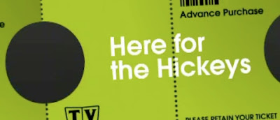
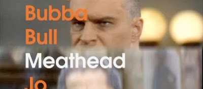
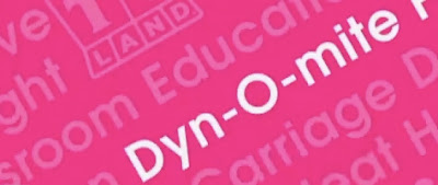
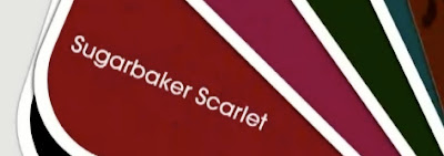

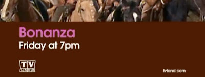
There have been several good tv network redesigns lately. Among them are the latest rebrands of AMC, National Geographic Channel, Bio, and QVC. (Yes, QVC.) Another is the much needed rebrand of TV Land. I have to admit I haven't watched TV Land in years, because what used to seem fun and familiar seemed to have become cheap and stale. Design firm Trollback + Company recently refreshed the brand by keying into the emotional context of retro television without falling victim to the expected retro trappings. Instead, they have based the look on the very modern concept of shuffling - much like you would with an iPod - to reflect TV Land as a vast library of retro TV favorites - and therefore a library of the emotions that go with them. Cleverly, catch phrases and icons from shows are often hidden in various ways, and also given equal importance with the show titles themselves. All type is in the instantly recognizable typeface 'Avant Garde', itself a retro but modern typeface - but one that doesn't become a character itself. Instead, the type works as a unifying agent across all elements. It's an intelligent approach that goes beyond the expected approaches, and refreshing to see. I find myself watching the Brady Bunch a lot more often recently. Now if I could only shuffle past Little House on the Prairie.
Watch a montage of the Trollback redesign of TV Land here:
