love thy neighbor
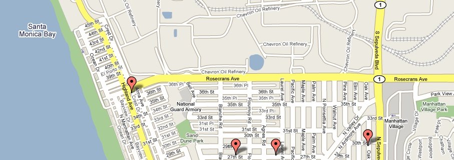
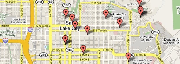
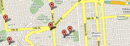
Political contributions being posted online is nothing new - even mashups of maps and political contributors is nothing new, they've been online for years. But the map mashups of Prop 8 contributors is creating controversy. The information has been online for a long time in list form - I looked up Manhattan Beach long ago to see who contributed. But having it in visual form is still somehow striking. I somehow take comfort that there are next to no bubbles in my neighborhood. But its not like you wont find bubbles right in the heart of 'accepting' or 'safe' neighborhoods like Castro or Hillcrest. Chilling? Maybe. But if so, it is for both sides. And the fact that this is somehow chilling or controversial, when the same map of contributions to Obama or McCain merits nothing more than a shrug, perhaps is worth some soul searching in itself.


