time change
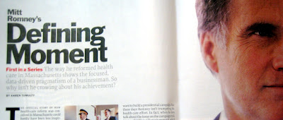
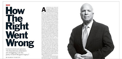
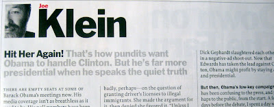
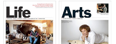
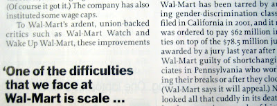
A week ago or so I picked up a Time magazine while sitting in a dentists office. I've subscribed to Newsweek for years, and it was immediately apparent that its been a long time since I've read an issue of Time. The magazine has undergone a complete overhaul and redesign. (Of course, the redesign was unveiled back in March... so its only new to me.) Most striking to me was the beautiful use and sensitivity for white space - virtually unheard of in a newsmagazine. The redesign also features a return to the use of Franklin Gothic as its primary sans serif font, often used remarkably boldly; along with a strong use of the grid for page formats. The result is a magazine of more usable bits of current information as opposed to a recap of the past week's events. The redesign was done by Luke Hayman (along with Paula Scher) of Pentagram and Time Art Director Arthur Hochstein and Deputy Art Directors Cynthia Hoffman and DW Pine. On the negative side, I will admit that I find the first full spread of the "Briefing" section a little mish-mashy and hard to read. But my main complaint is the use of Proforma as the serifed text face for articles. The small counters in the lower case a's and e's make large blocks of type hard to follow and read smoothly. (Counters are the size/shape of the enclosed or partially enclosed area of a letter - like the center of an 'e' or the inside of an 'n'.) Nevertheless, the redesign is a well-designed and well thought out evolution of the standard-bearer of newsmagazines that stays true to its past while positioning it for the future. I can't imagine the hurdles that had to be jumped through to achieve this, so bravo to the team for a job well done.
More details and full spreads are in this link to Pentagram's blog entry about the project:
